The interface
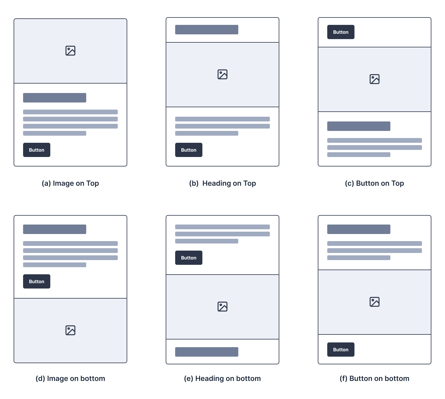
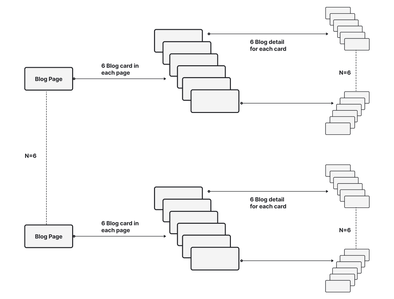
Six blog cards per page, each built from the same four elements: image, heading, paragraph and button. Only the content changed between cards, so nothing but the variable moved.
Designers argue about call to action design constantly: make it a button, make it an image, move it to the top. I wanted to know whether any of it holds up when you test it properly.
So I built 216 interfaces in Figma, put twelve people in front of them, and recorded 432 clicks across three call to action types and two positions. The statistics came out flat. The interviews did not.
The questions
Two research questions, one controlled study. RQ1 asks which of text, button or image people prefer. RQ2 asks whether placing it at the top or the bottom of a card changes that preference.
Where it starts
People judge what is clickable from prior experience, not from the page in front of them. Blue text and rectangular buttons work because they were learned, and those signifiers keep shifting as interfaces change.
Previous work says position matters. Part of what makes this study interesting is that mine did not agree.
People arrive carrying a mental model built from every other site they have used.
Burnett (2014). Recognisable labels and layouts matter, because people judge what is clickable against their prior experience of the web.
Nielsen. Life is too short to click on things you do not understand. Blue text and rectangular buttons became conventions because they were learned.
Not every image is treated the same way.
Nielsen (2010). Large decorative images get ignored. Photos of real people and real products are treated as content and studied closely.
Li, Tang and Zhao (2023). Click behaviour correlates positively with how interested someone is in the topic in front of them.
Preference is only one of several forces acting on a click.
Lu, Zhang and Ma (2018). Position on the page, trust in the source and the way content is presented all shape the decision, alongside personal preference.
Preferences also shift over time, particularly after the first few clicks.
A call to action is a request to go one step further, and its format changes the outcome.
Chen, Yeh and Chang (2018). Advertising format and call to action design directly alter recognition and the behaviour that follows.
Qin et al. (2020). Across six months on Taobao, 23% of users performed over a thousand actions each, enough to make click prediction worth getting right.
The build
Every card used the same four elements so nothing moved except the variable under test. Only the copy changed between cards, to stop people recognising content rather than form.
The interface
Six blog cards per page, each built from the same four elements: image, heading, paragraph and button. Only the content changed between cards, so nothing but the variable moved.
The variables
Three call to action types, text heading, button and image, each shown in two positions, top and bottom of the card. Six conditions in total.
The scale
216 interfaces: six unique blog page sets, six cards in each, and six intermediate pages behind every card.
The intermediate page
Every click led to a page explaining more about the study, which kept the task moving and reduced learning bias between rounds.
Who and where
Who took part
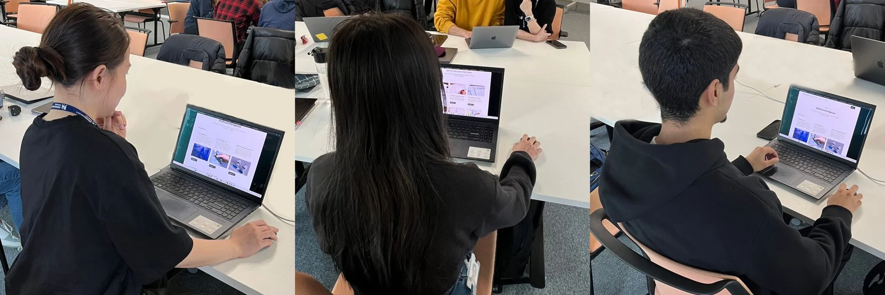
Twelve people from the university, six male and six female, students and staff, aged 20 to 40. Mean age 26.83, standard deviation 3.82.
Screening
An Ishihara test ruled out colour blindness. One participant was excluded on that basis, leaving eleven valid.
Consent and payment
Everyone signed a standard consent form before starting. Nobody was paid to take part.
Setup
April 2024, one room, controlled lighting to keep glare off the screens. ASUS VivoBook Pro 15 at 1920 by 1080, prototype in Figma, screen captured throughout.
How it ran
Training first
Everyone got a step-by-step walkthrough and a demonstration on the same laptop, using a task built to mirror the real one, so nobody was learning the interface during the test.
Two groups, order balanced
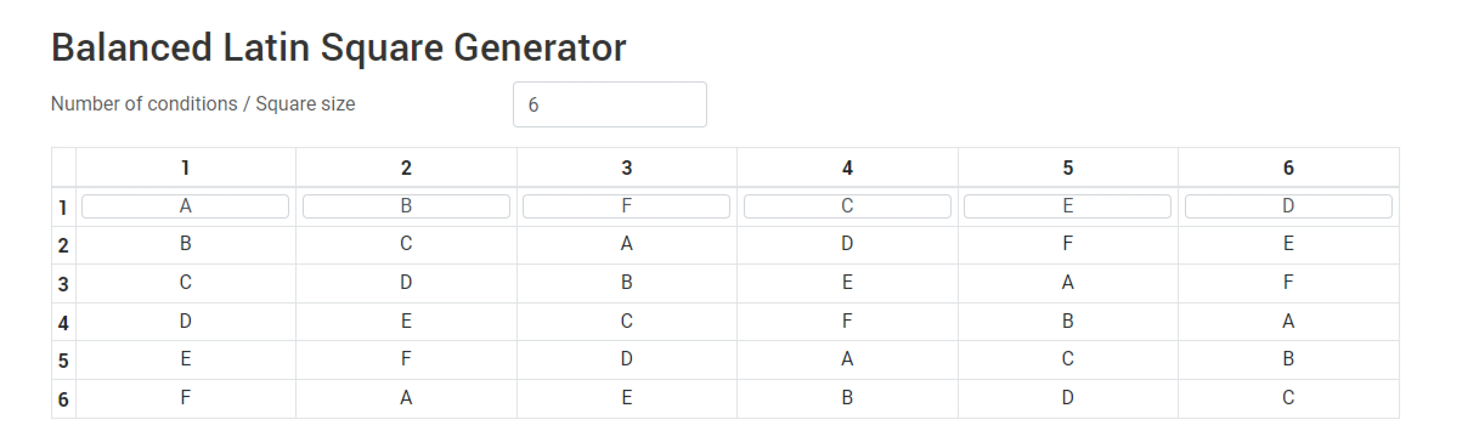
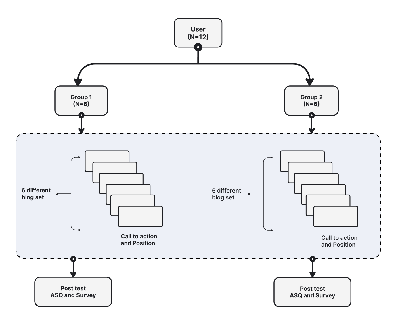
Twelve people split into two groups of six. A balanced Latin square randomised the order of the six blog sets, and each set was repeated twice, so two people ran every test.
Twelve clicks each
Six clicks across the positions and six on the intermediate pages. People were told everything on the page was clickable and could use the mouse or the trackpad.
Afterwards
An After Scenario Questionnaire and a twelve-question survey, to get at why people clicked what they clicked.
Call to action
H0. All elements are equally effective in prompting clicks.
H1. Visual elements, particularly buttons and images, are more effective than text-based elements.
Position
H0. The position of the call to action has no impact on clicking behaviour.
H1. The position of the call to action has minimal impact on clicking behaviour.
The tests
A Shapiro-Wilk test showed the data was not normally distributed for buttons, images or either position, so I used a non-parametric Mann-Whitney U test at a 5% alpha level.
Normality, Shapiro-Wilk
| Variable | Significance | Normal |
|---|---|---|
| Button | < .001 | No |
| Image | .034 | No |
| Heading | .514 | Yes |
| Top position | < .001 | No |
| Bottom position | < .001 | No |
Comparison, Mann-Whitney U
| Pair | U | Z | p |
|---|---|---|---|
| Button and image | 529.5 | −0.033 | 0.974 |
| Button and heading | 87.5 | −0.921 | 0.375 |
| Image and heading | 62.5 | −0.989 | 0.322 |
| Top and bottom position | 598.5 | −0.620 | 0.535 |
Every p value sits above 0.05, so the null hypothesis holds in each case.
What the data says
No element wins
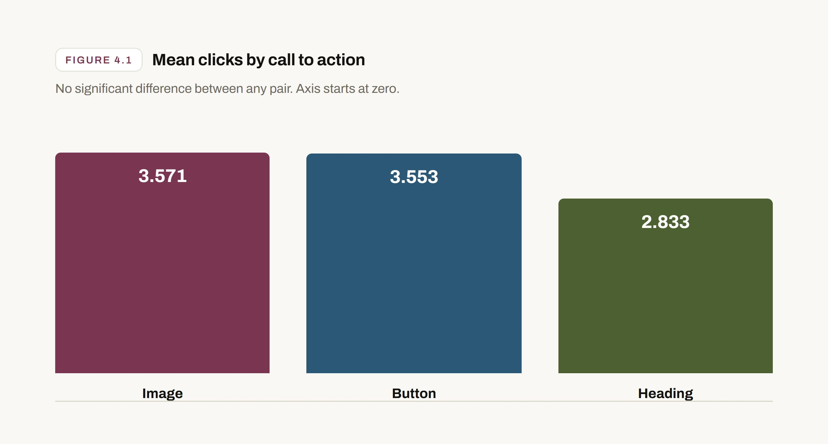
Across every pair, the difference in clicks was not statistically significant, so the null hypothesis holds: text, button and image are equally effective at prompting a click.
The means are close. Image 3.571 and button 3.553 are almost identical. The heading sits lower at 2.833.
People lean towards the more visually prominent element, but not by enough to call it a difference.
Position does not decide it
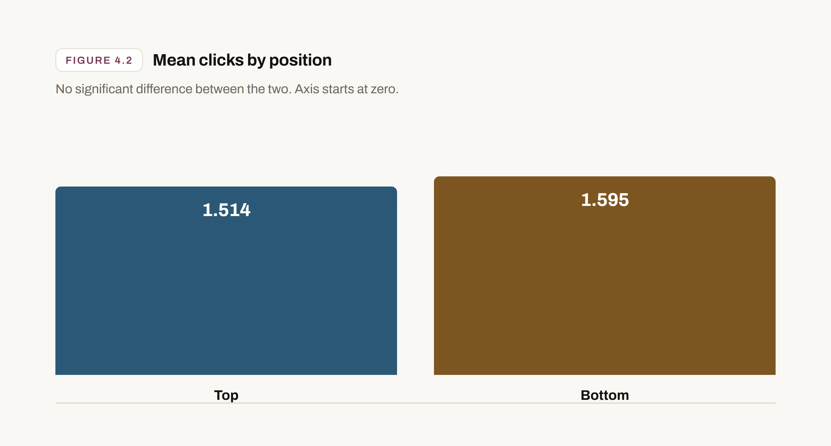
Top and bottom produced no significant difference either, on their own or when tested against each individual element.
Top 1.514, bottom 1.595. Close enough to be the same.
Per element: position against button and image p = 0.436, against button and heading p = 0.906, against image and heading p = 0.753. None significant.
Habit is what actually decides
The qualitative data says more than the statistics. People found a pattern early and stuck to it.
Order of preference: button first, then image, then heading.
66.7% said images were the most compelling call to action, 50% preferred clicking a button, 8.3% found headings effective.
50% said the position made no difference to them.
In their words
“Used the buttons throughout. I knew I could have clicked the header or image but chose to continue to do what I learnt.”
The After Scenario Questionnaire averaged 6.50 out of 7 on all three questions, so the task itself was not the problem. People understood what they were doing. They just kept doing the first thing that worked.
The short answer
No call to action type and no position produced a significant difference, so both null hypotheses stand. That is not a failed study. It says the thing designers argue about is not the thing doing the work.
What did the work was prior learning. Participants knew the heading and the image were clickable, said so out loud, and went on clicking the button anyway because it was what they had learned in the first round.
This also contradicts earlier work on placement. Once someone has a mental model of where the control lives, moving it does not appear to cost you the click.
Where I would take it
Change the surroundings
Test the same call to action placements inside different interface designs, so the context is a variable rather than a constant.
Widen the sample
Eleven valid participants from one university is enough to see a pattern, not enough to generalise from.
Follow the decision
Use the findings to look at how varying position affects the decision itself, not just the click that follows it.
432 clicks from twelve participants across six conditions, recorded with a screen capture tool and labelled by element and position.
An After Scenario Questionnaire and a twelve-question post-test survey. All quotes come from these sessions.
Analysis in SPSS: Shapiro-Wilk for normality, Mann-Whitney U at a 5% alpha level.