Simple
Users spend minimal time inside SunSafe, sun protection never becomes an extra daily burden.
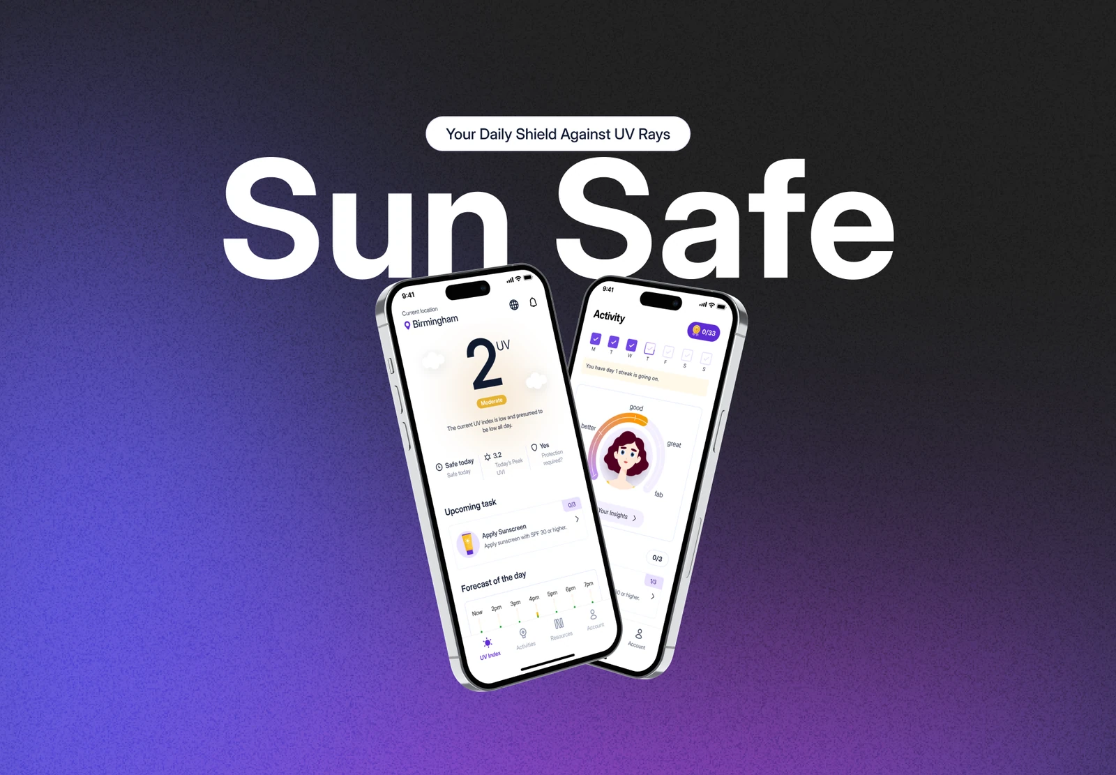
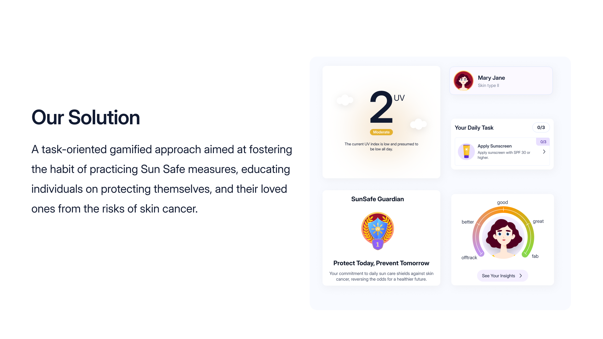
SunSafe educates people on protecting themselves and their loved ones from the risks of skin cancer, turning UV awareness into simple, gamified daily actions that fit seamlessly into everyday routines. It combines real-time UV tracking, smart reapplication reminders and wearable integration inside a calm, accessible interface.
Why it matters
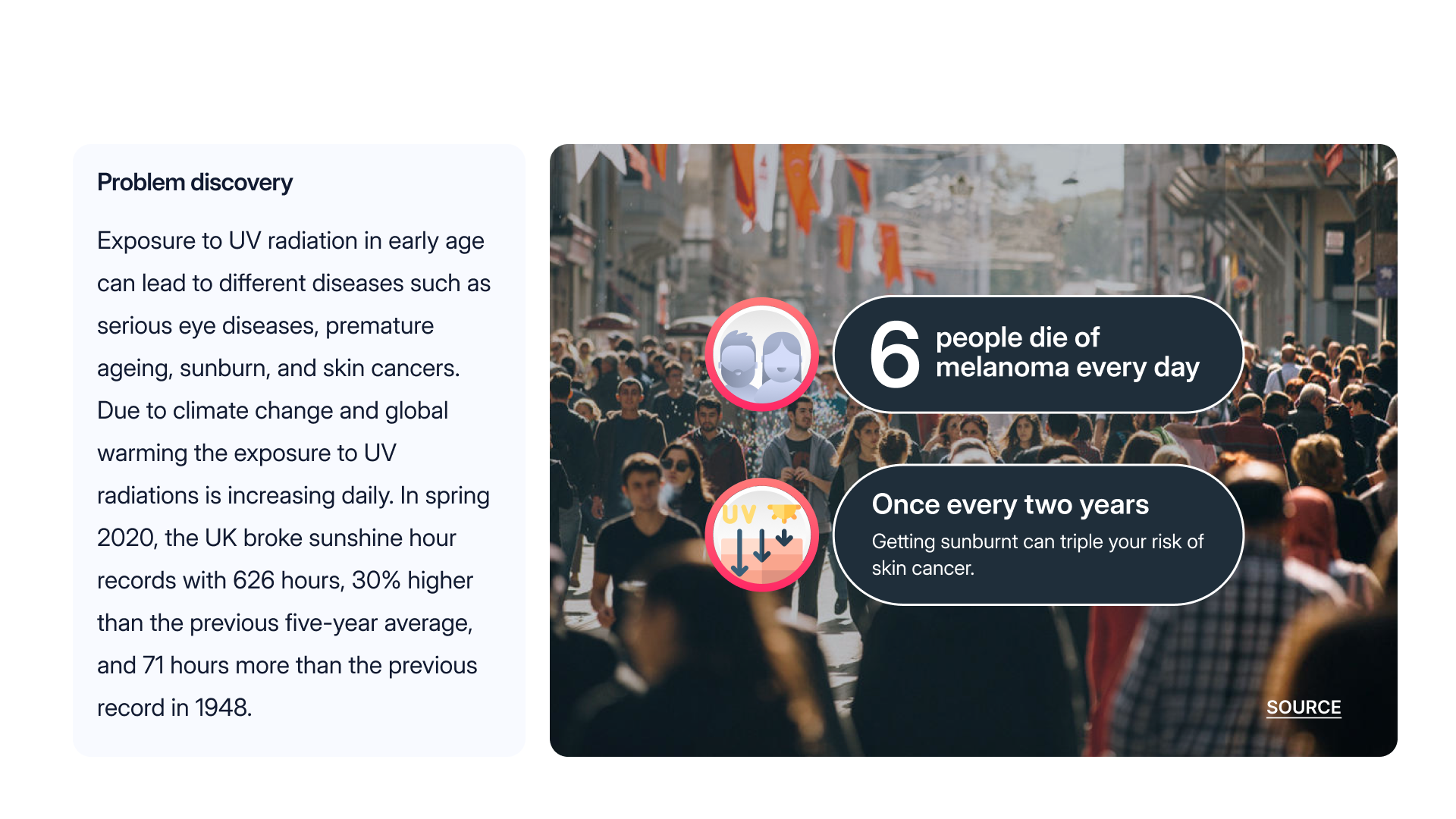
Exposure to UV radiation from an early age can lead to serious eye disease, premature ageing, sunburn and skin cancer. Six people in the UK die of melanoma every day, and a single episode of sunburn can triple the risk of skin cancer. With climate change, daily UV exposure keeps climbing, in spring 2020 the UK broke sunshine records with 626 hours, 30% above the five-year average. Yet existing apps are either purely informational or cluttered with complex data.
How might we
How I ran it
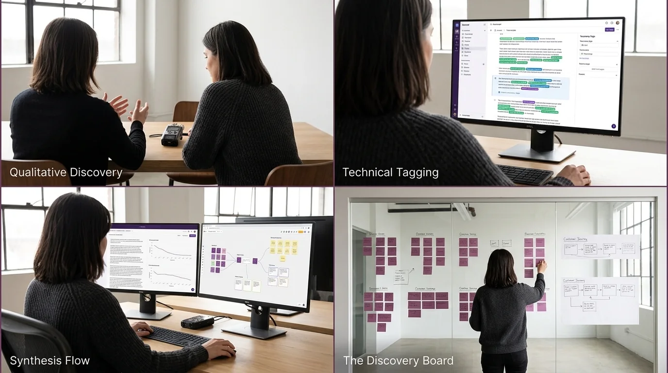
Before designing anything, I ran a mixed-methods discovery study, a 25-question survey alongside three in-depth interviews, to learn how people actually relate to sun safety, rather than how I assumed they did.
Three in four never check the UV index, a widespread gap in sun-protection awareness.
Nine in ten wanted proactive, personalised sun-safe guidance, a clear appetite for educational content.
Even where UV data exists, three-quarters overlook it, visibility and relevance are too low.
Two in five spend significant time outdoors in the afternoon, when UV risk is highest.
What it changed
These patterns shaped the five personas, the feature priorities and the behavioural approach that follow.
Three principles
SunSafe fosters lasting UV-protection habits by combining behavioural science with a calm, accessible interface. Three principles guided every decision.
Simple
Users spend minimal time inside SunSafe, sun protection never becomes an extra daily burden.
Visual
Clear visual representations of progress and exposure that encourage daily accountability.
Coherent
Sun-safe practices slot into existing routines, reducing breaks in concentration.
Nine features, one effortless routine
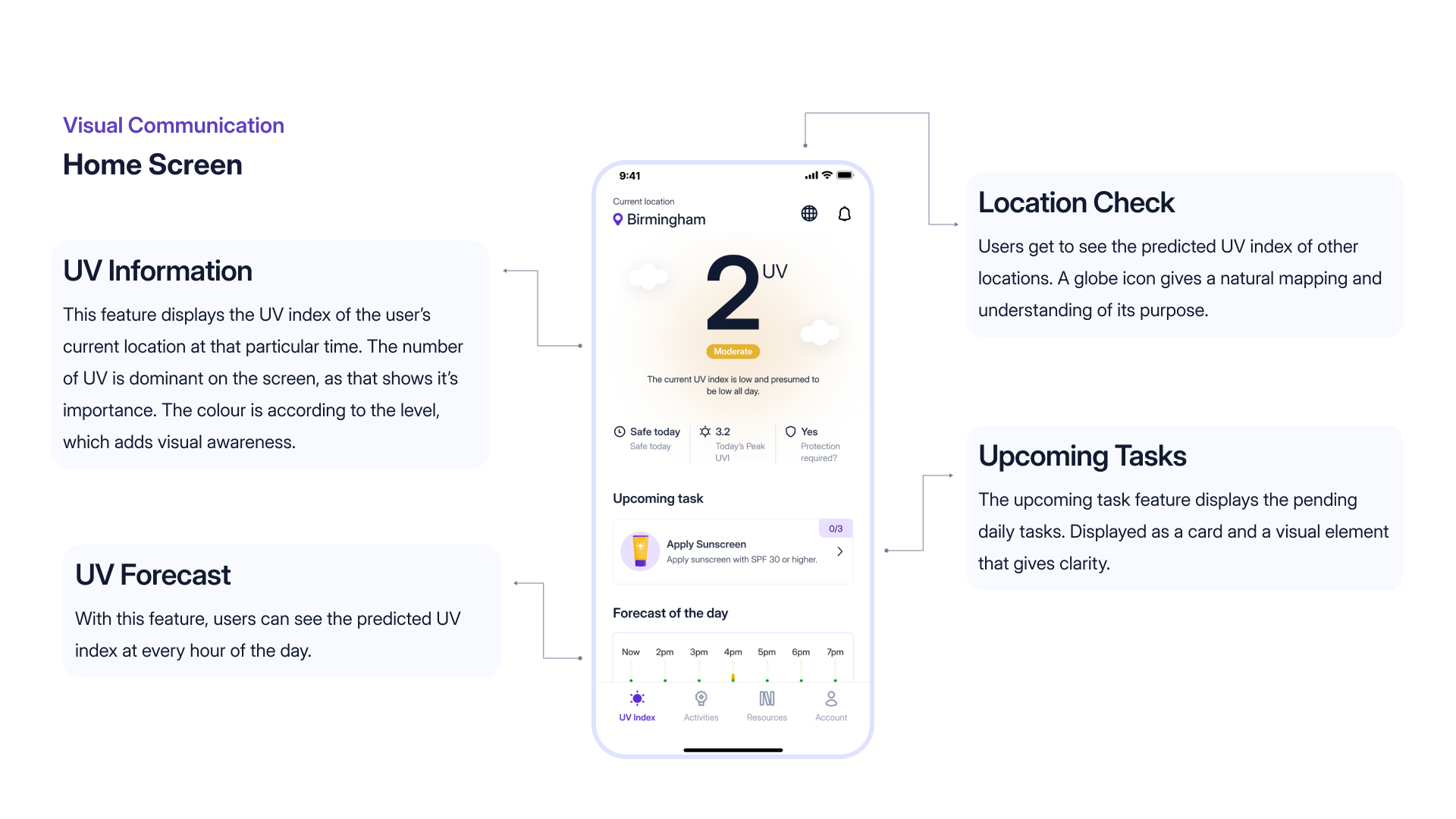
Real-time UV index tracking
Live local UV index with hourly forecasts and threshold warnings.
Gamified daily tasks & streaks
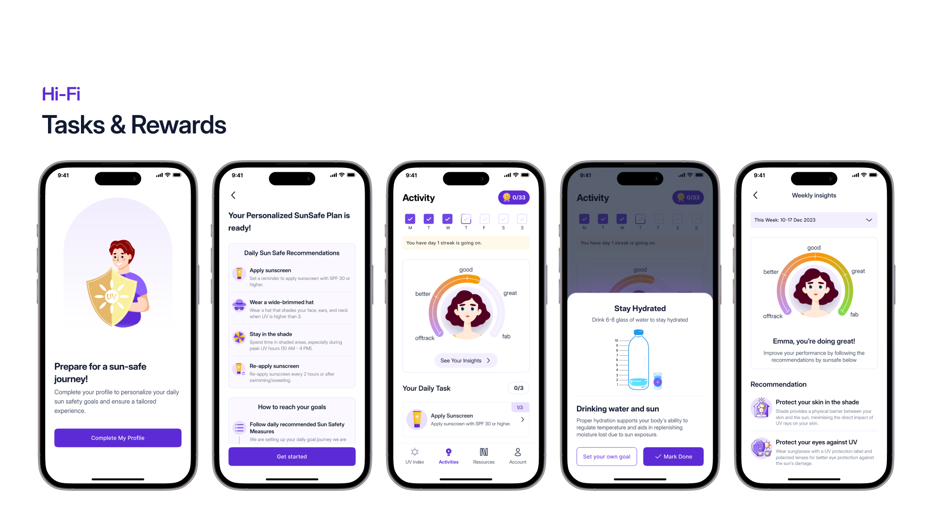
Micro-habits (apply SPF, wear sunglasses, check the UVI) tied to streaks and a SunSafe Guardian badge, with progress read on a five-step scale from offtrack through good, better and great to fab.
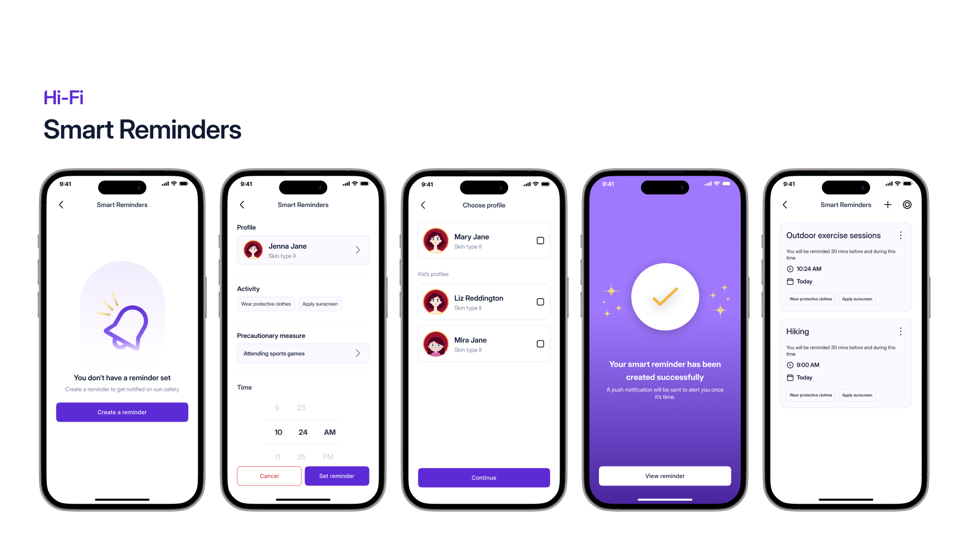
Smart reapplication reminders
A timer triggered automatically from skin type, UV index and activity level.
Apple Watch integration
Quick check-in and reapplication alerts, right on the wrist.
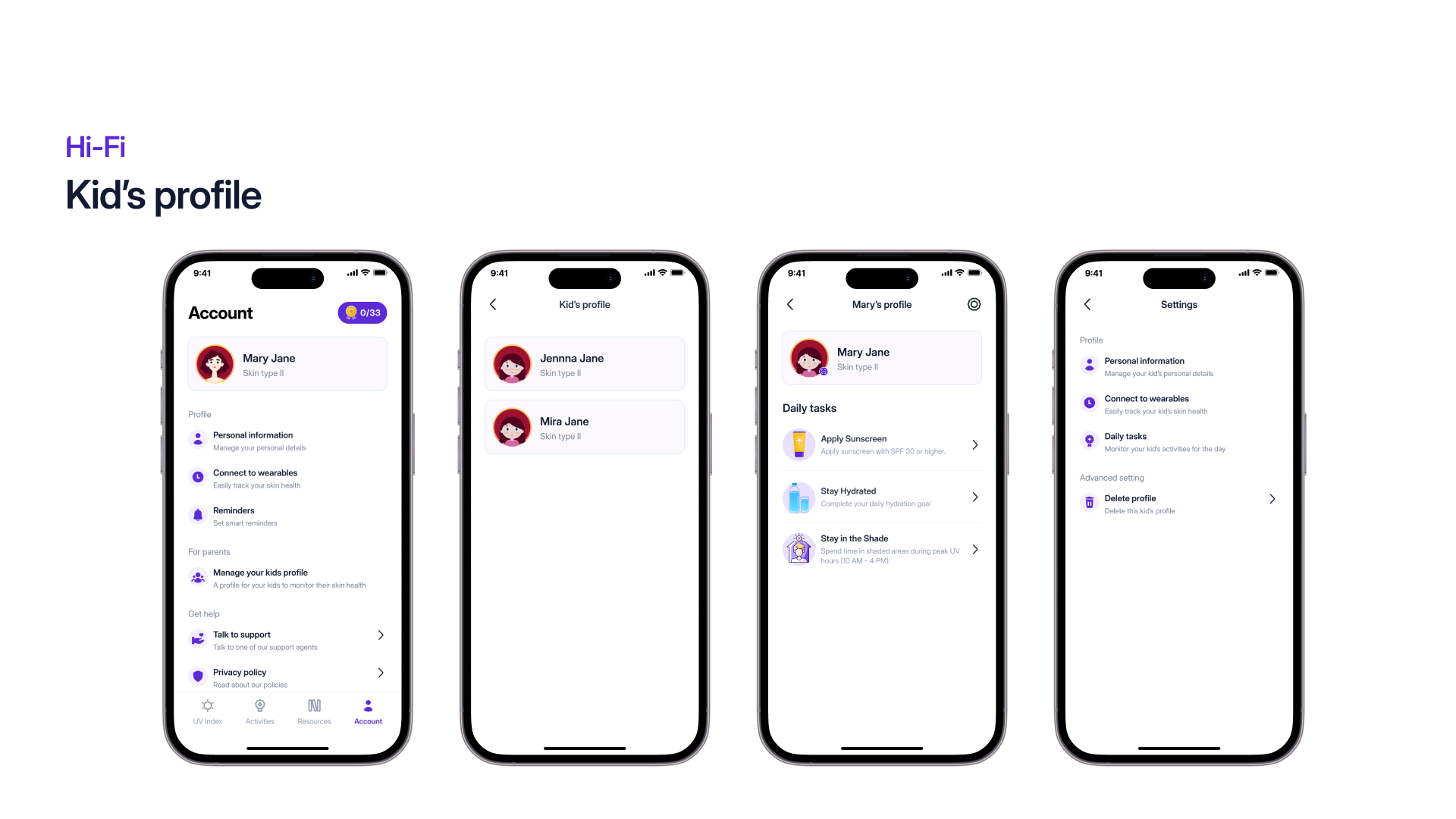
Family & kids profiles
Multi-profile management so parents can track children’s sun exposure.
Skin-type personalisation
A face scan, taken with the user’s consent, or four questions answered manually, sets the skin type and generates a personalised avatar that tailors every piece of UV advice.
Multiple locations
Add and monitor several places at once and read the UV index and forecast for each, the most-requested feature in the app reviews.
Home-screen widget
A glanceable widget carrying the current UV index for the user’s location, their upcoming daily tasks and a mini-chart of skin-health progress.
Colour-blind accessibility
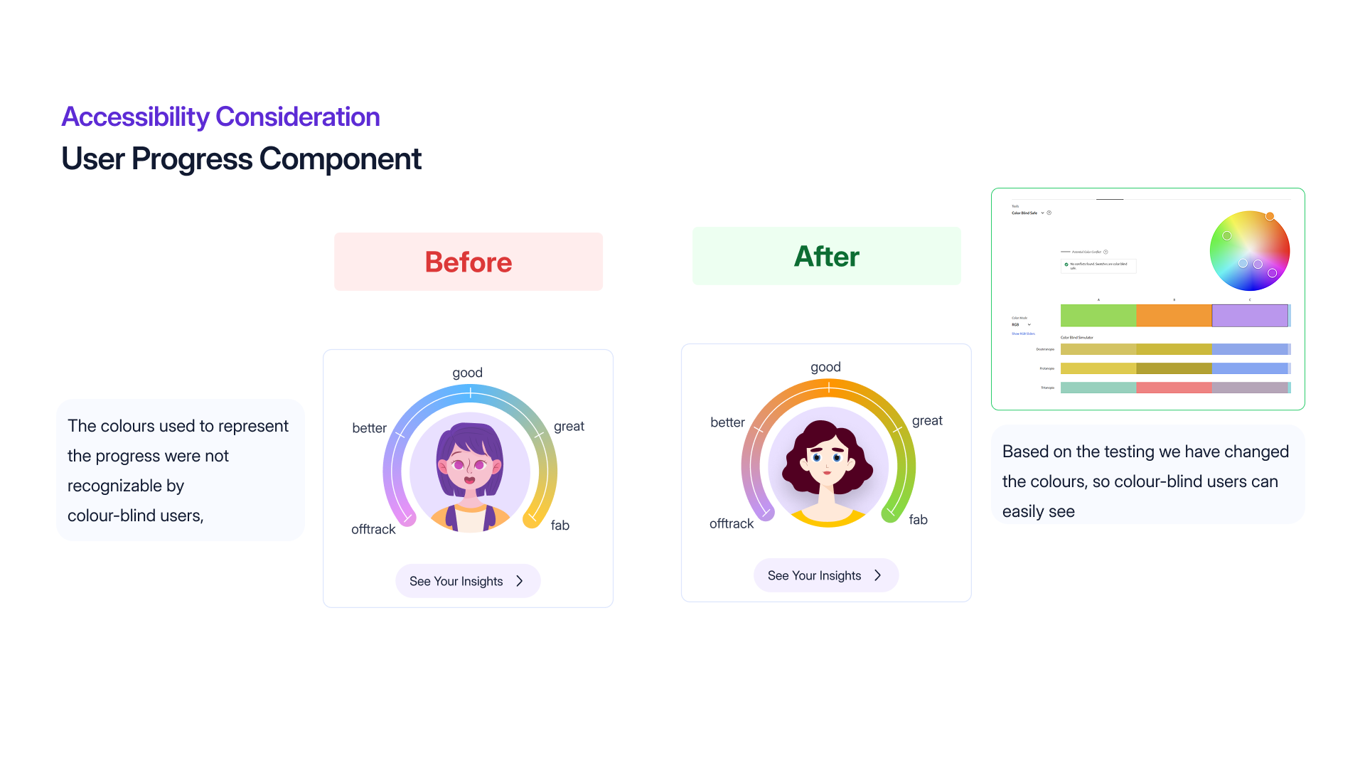
A dual-encoded visual system (colour + icons/patterns) engineered to WCAG AA/AAA.
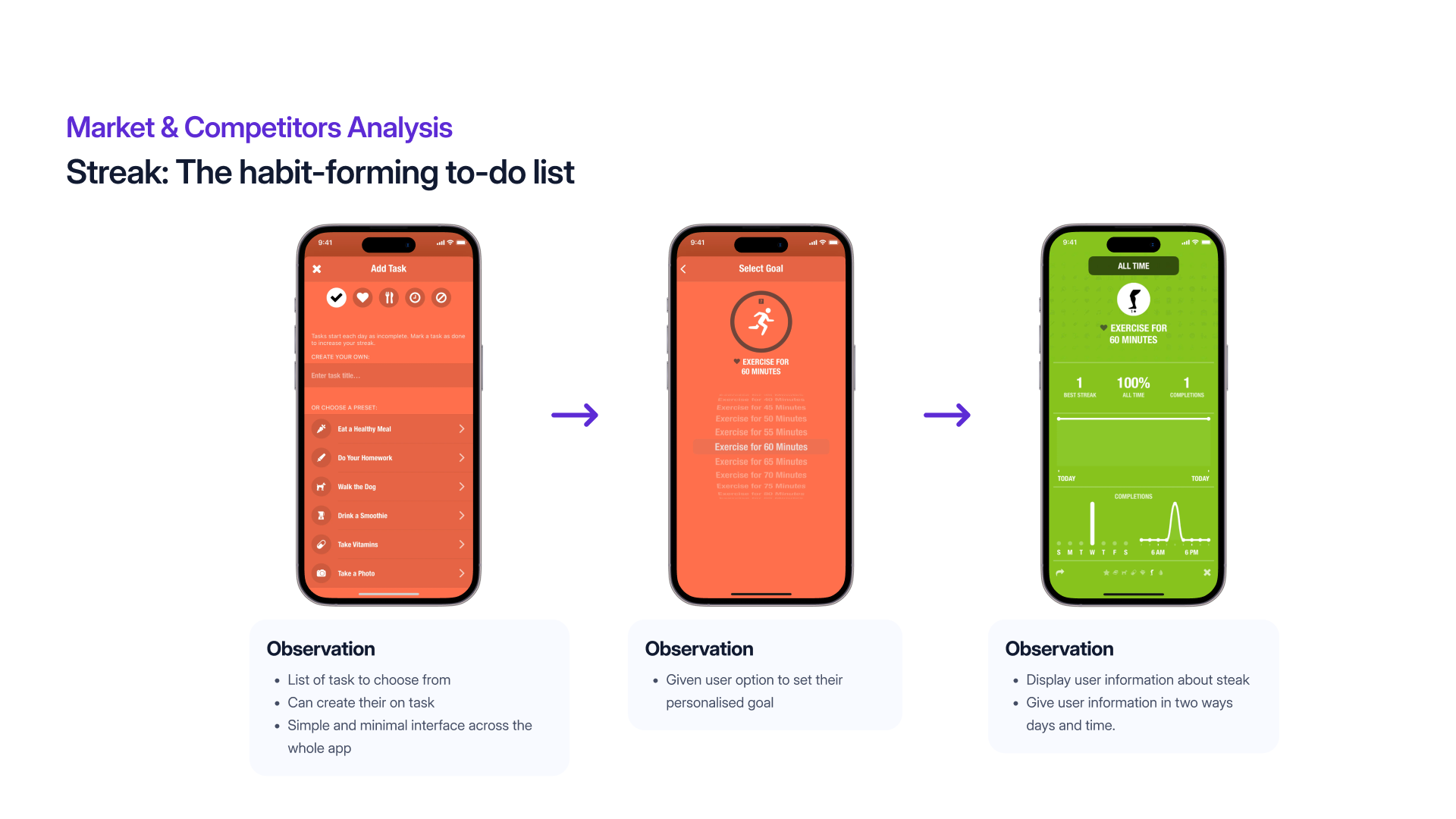
The Hook Model
To make sun safety stick, SunSafe applies Nir Eyal’s Hook Model, the loop that turns a prompted action into a self-driven habit.
Trigger
External high-UV alerts and reapplication timers; internal desire to protect skin and family.
Action
One-tap task completion, e.g. “Applied SPF 50”.
Variable reward
Daily streak counter, SunSafe Guardian badge progression, community impact score.
Investment
Setting skin type, custom locations, connecting Apple Watch and customising kids’ profiles.
Competitor analysis
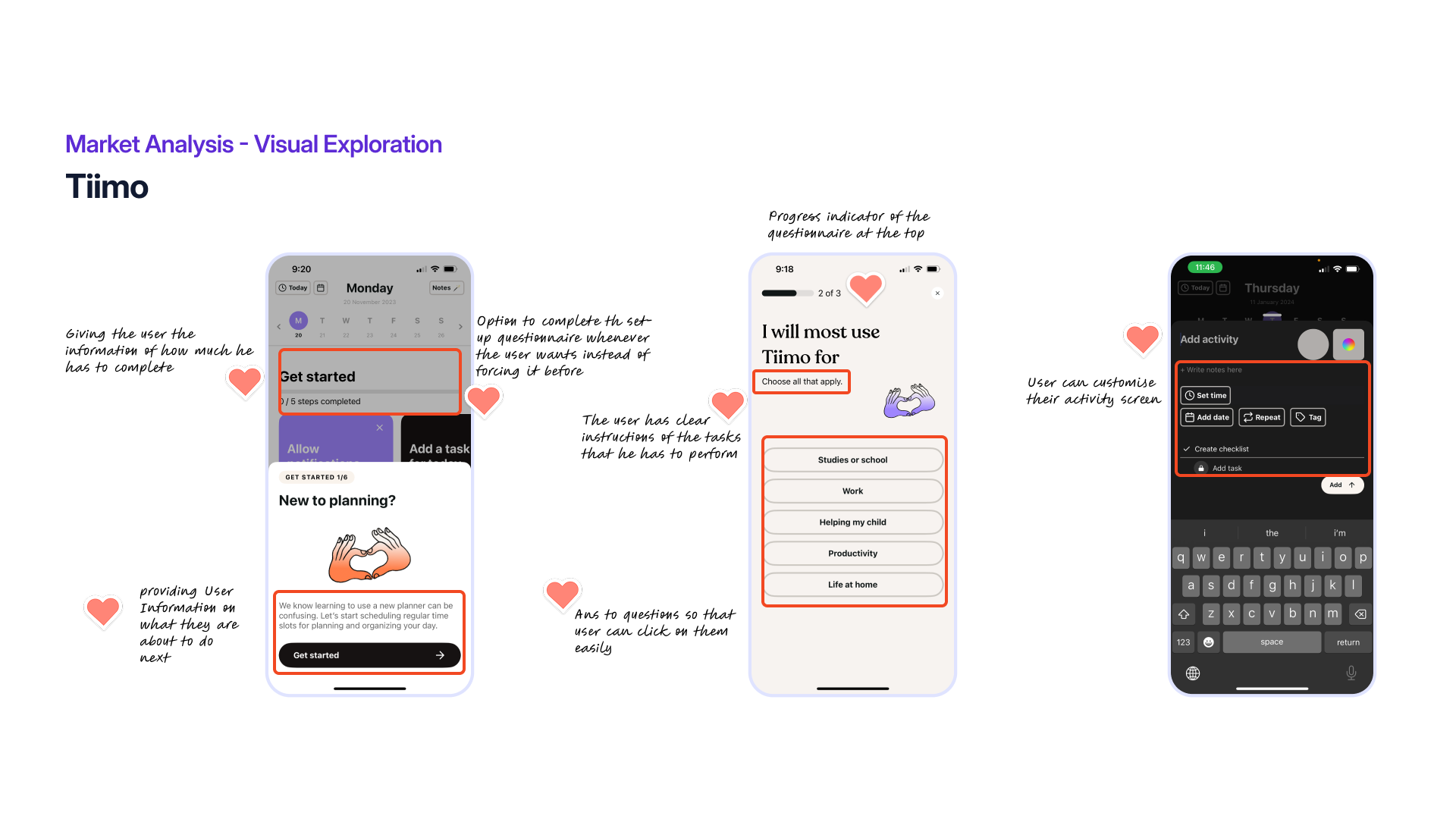
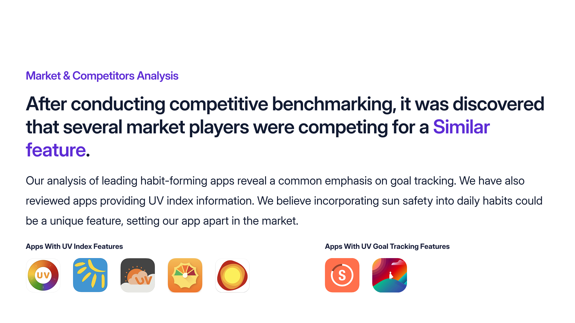
I benchmarked five live UV apps against a feature matrix. Every one tracks the UV index, but none supported multiple-user profiles or wearables, and only one offered skin-type personalisation, and none combined these with gamified habit-building.
| Feature | SunSafe | UV Index | Sun Smart | UV Lens | UVI Mate | Sun Index |
|---|---|---|---|---|---|---|
| Location | ✓ | ✓ | ✓ | ✓ | · | · |
| UV index | ✓ | ✓ | ✓ | ✓ | ✓ | ✓ |
| External device / wearable | ✓ | · | · | · | · | · |
| Multiple user profiles | ✓ | · | · | · | · | · |
| Forecast | ✓ | ✓ | ✓ | ✓ | · | · |
| Warnings | ✓ | ✓ | · | · | · | · |
| Vitamin-D tracking | ✓ | ✓ | · | · | · | · |
| Sunscreen reminder | ✓ | ✓ | · | · | · | · |
| Face analyser / skin age | ✓ | ✓ | · | · | · | · |
| Free to use | ✓ | ✓ | · | · | · | · |
| Skin type | ✓ | ✓ | · | · | · | · |
What users were asking for
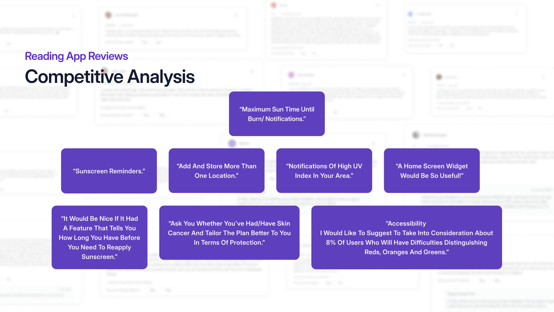
A review analysis of existing apps surfaced consistent, unmet needs, from reapplication reminders to colour-blind accessibility. Each one of these became a feature.
A home screen widget would be so useful!
Add and store more than one location.
Notifications of high UV index in your area.
It would be nice if it had a feature that tells you how long you have before you need to reapply sunscreen.
Ask you whether you’ve had/have skin cancer and tailor the plan better to you in terms of protection.
I would like to suggest to take into consideration about 8% of users who will have difficulties distinguishing reds, oranges and greens.
Five personas
Five personas came out of the discovery survey and the three interviews, written to cover the full range of relationships people have with the sun, from someone who seeks it out to someone existing apps quietly shut out.
They became the brief for everything that followed. Mike and Olivia made the case for reminders that need no thought, Sarah drove the kids’ profiles, Rachel pushed the community and awareness side, and Jane turned colour-blind accessibility from a nice-to-have into a requirement.
32, Marketing Manager
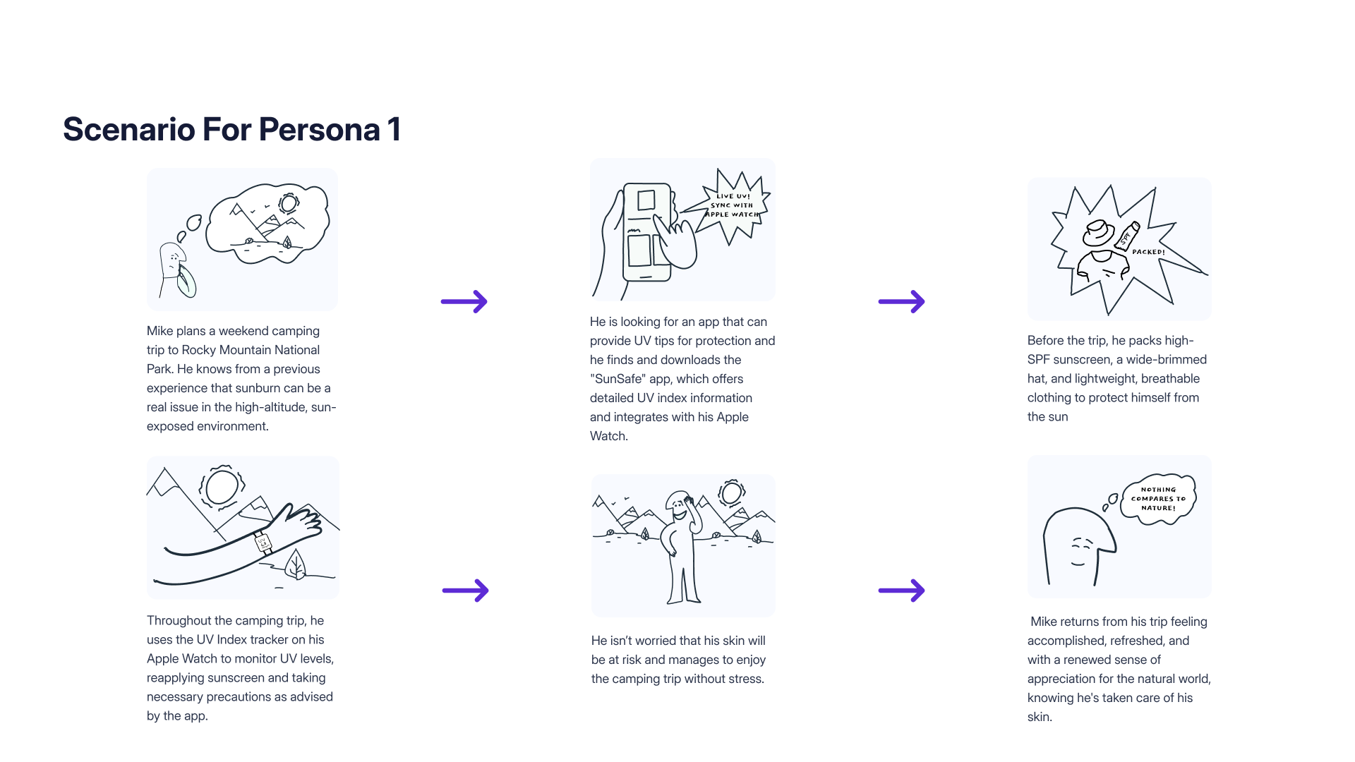
An adventurous marketing manager from Denver, Colorado, who loves the outdoors and activities like hiking, camping and skiing in the Rocky Mountains.
Pain points
Past experiences of getting sunburned during camping trips.
Concerns about skin health and potential long-term damage.
Balancing technology use with the desire for a tech-free outdoor experience.
Overwhelming information and product options in the market.
Goals and needs
To enjoy outdoor activities and adventures without the risk of sunburn or skin damage.
To connect with nature and appreciate its beauty, ensuring it remains a part of his life.
To use technology to enhance his outdoor experiences and stay informed about UV levels.
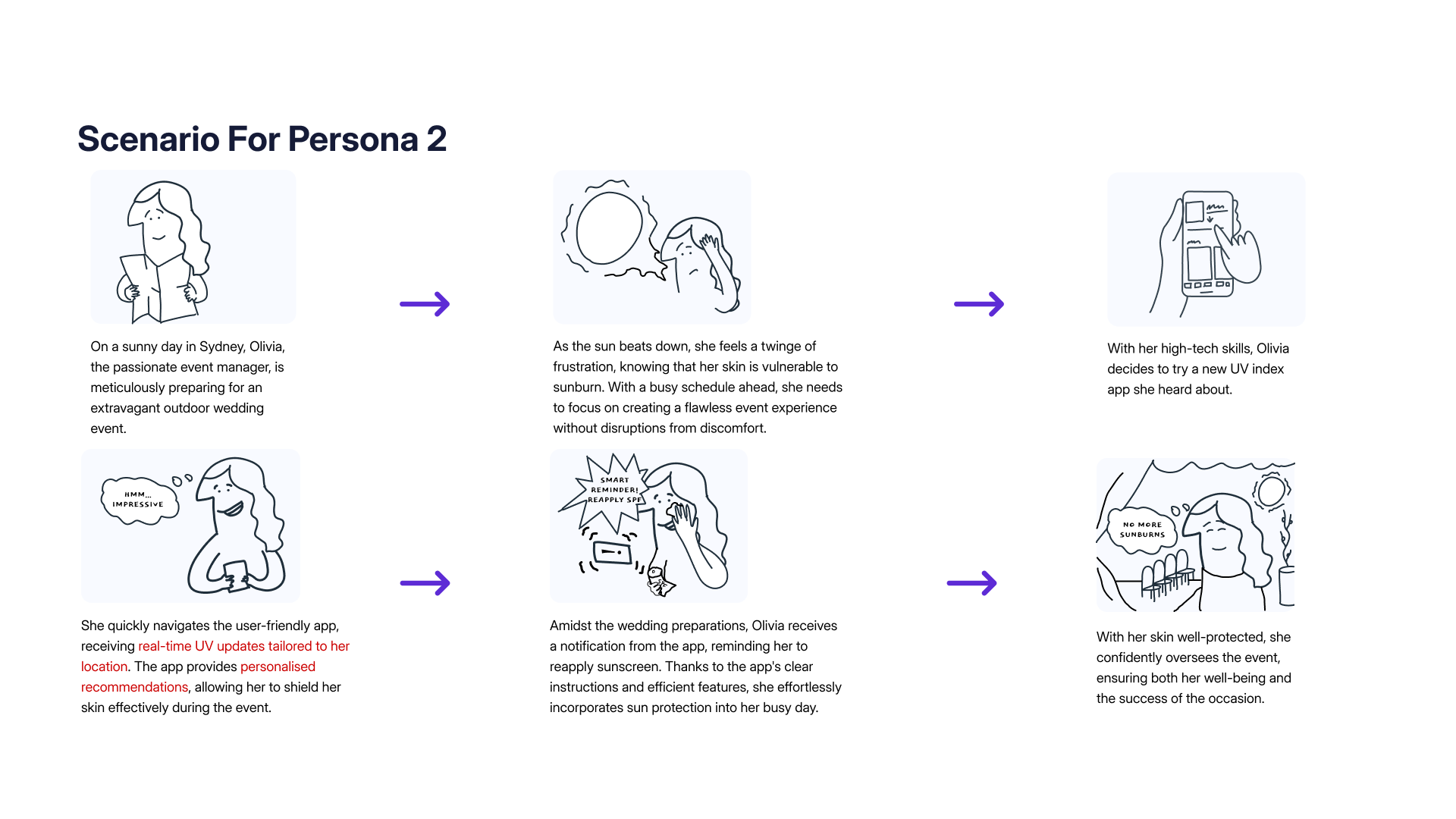
32, Event Manager
An event manager who passionately plans and executes events of every size, most of them outdoors.
Pain points
Decreased work efficiency, recurring sunburns cause frustration and cut into her focus.
Bad time management, using too much makeup to hide sunburn on a busy schedule makes her want a simpler skincare routine.
Lack of knowledge, she is frustrated by how little sun-protection guidance suits her lifestyle and profession.
Goals and needs
Work without distractions and sunburn discomfort, maintaining high productivity and focus.
Minimise sunburn risk and protect her skin from harmful UV rays during outdoor events.
Find reliable information to make informed decisions about sun protection around a busy lifestyle.
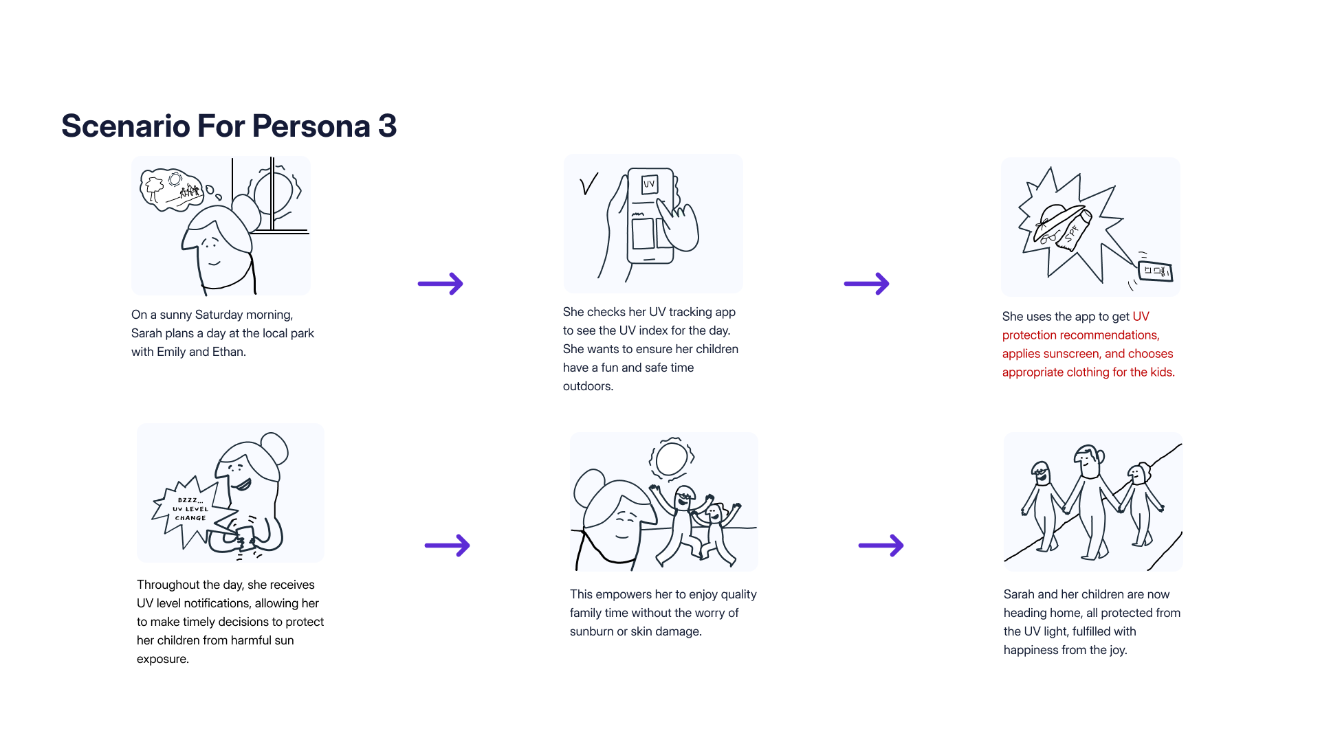
25, Mother
A devoted mother concerned about her children’s exposure to the sun during outdoor activities, who applies their sunscreen herself on a sunny day.
Pain points
Worries about the risk of sunburn and skin damage in her children.
Difficulty in keeping her kids protected from the sun during outdoor play.
Limited time and resources to research UV protection methods.
Overwhelming information and product options in the market.
Goals and needs
Ensure the safety and well-being of her children during outdoor play and activities.
Educate her kids about sun safety and instil good habits.
Find a reliable way to monitor UV levels and protect her children from sunburn and skin damage.
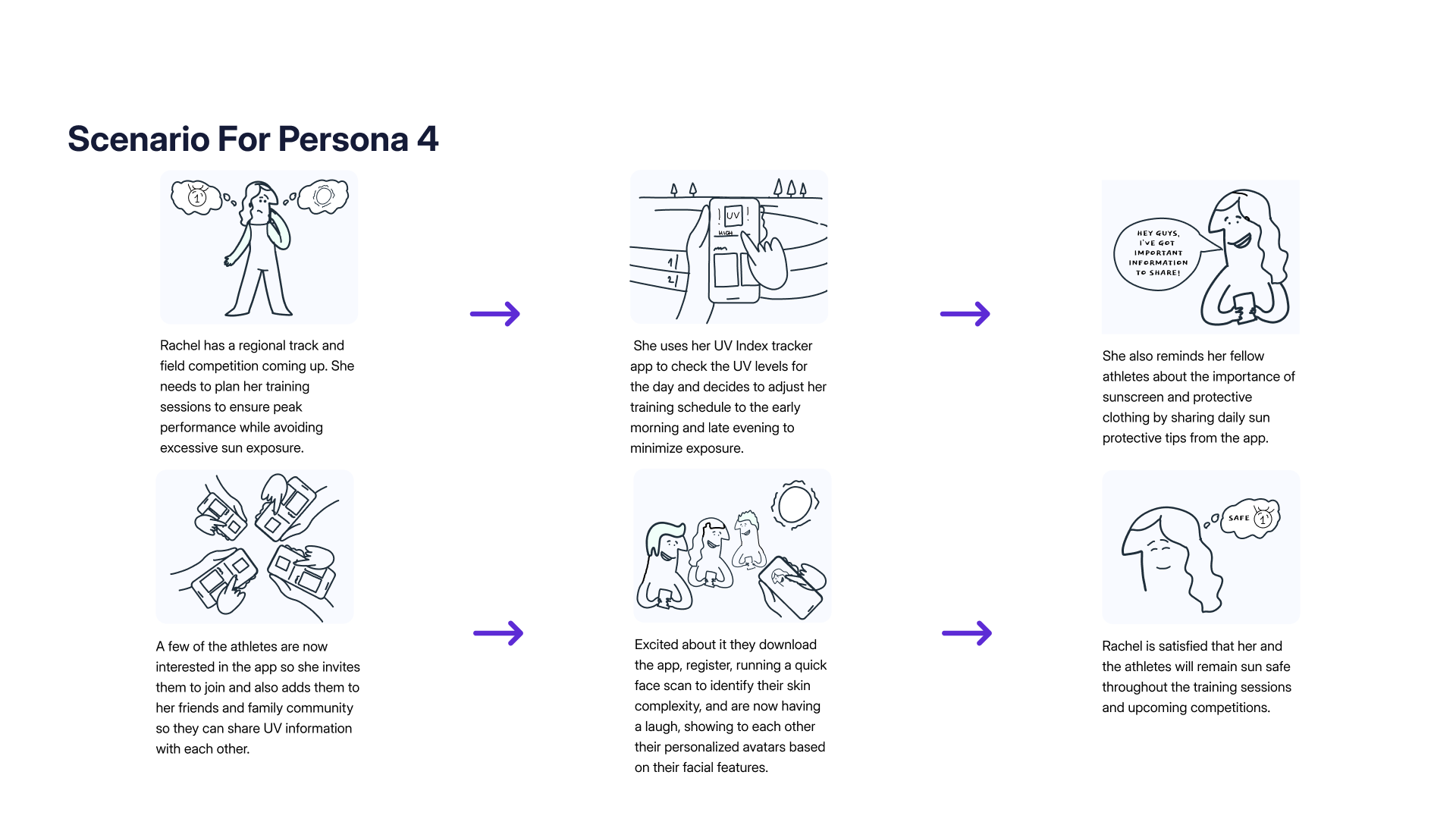
22, Student Athlete
A passionate college student and dedicated track athlete at UCLA, who has triumphed over her battle with skin cancer.
Pain points
Balancing rigorous training and sun protection.
Fear of a skin cancer relapse and its impact on her athletic career.
The stigma, or lack of awareness, about skin cancer among athletes.
Goals and needs
Excel in her track and field events at the collegiate level.
Continue her education to pursue a career in sports medicine.
Take care of her skin health by taking the precautionary measures suggested by her doctor.
Raise awareness about the importance of sun protection among fellow athletes and the wider community.
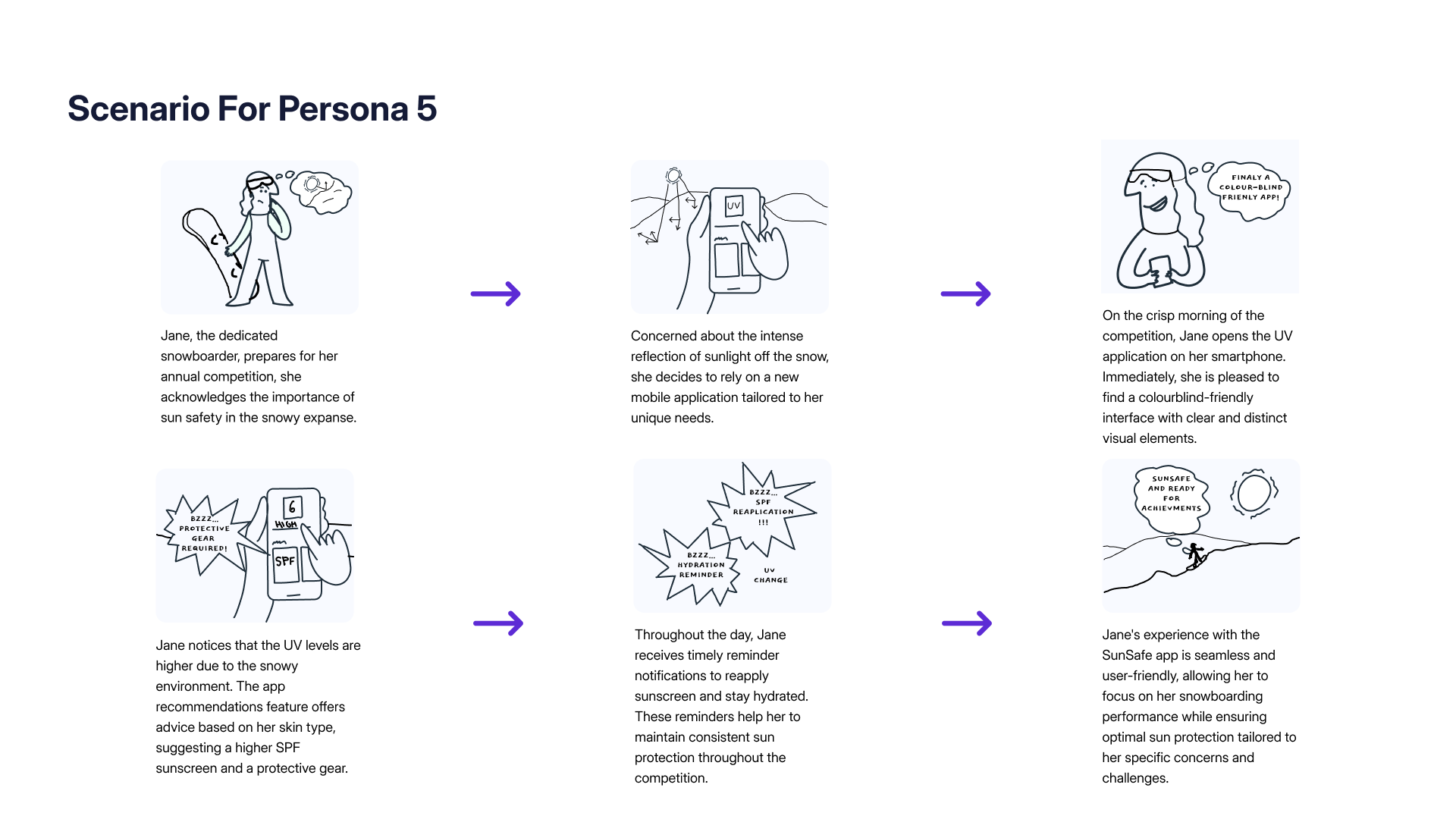
19, University Student
A student in higher education who takes part in professional snowboarding competitions every year.
Pain points
Worries that the intense reflection of sunlight off the snow increases the risk of sunburn and contributes to long-term skin issues.
Difficulty using a UV mobile application, because colourblindness makes the visual elements hard to tell apart.
Experiences eye irritation from the persistent exposure to UV rays during her annual snowboarding events.
Struggles to visually identify early signs of sun damage.
Goals and needs
Real-time UV index data specific to her location, with reminders for sunscreen reapplication and hydration intervals.
Colourblind-friendly features, so information and alerts are carried by accessible visual elements or alternative indicators.
Recommendations for suitable UV-protective gear, such as sunglasses or clothing, that account for her colourblindness.
Scenarios
I storyboarded a day in each persona’s life to ground the features in real moments.
From behavioural research to a tested product
Research
Behavioural analysis (Hook Model), competitor research and user-review analysis.
Ideation
Concepts for onboarding, home, reminders and the gamification system.
Wireframing
Low-fidelity sketches and user flows for onboarding, tasks and reminders.
Prioritisation
Card sorting and affinity mapping to structure the information architecture.
Visual design
A purple-based, accessible design system with reusable components.
Testing
Usability testing and accessibility evaluation using the SUS methodology.
Card sorting
An open card sort with five participants, followed by affinity mapping, grouped every feature into eight natural buckets, which I then consolidated into the four primary tabs.
Home-screen
Alerts & Notifications
User Profile
Resources
Registration
Trackers
Tasks & Rewards
Location
The four-tab structure
Card sorting and affinity mapping shaped a four-tab structure, UV Index, Activities, Resources and Account, sitting under a splash and registration flow.
User registration
UV Index
Activities
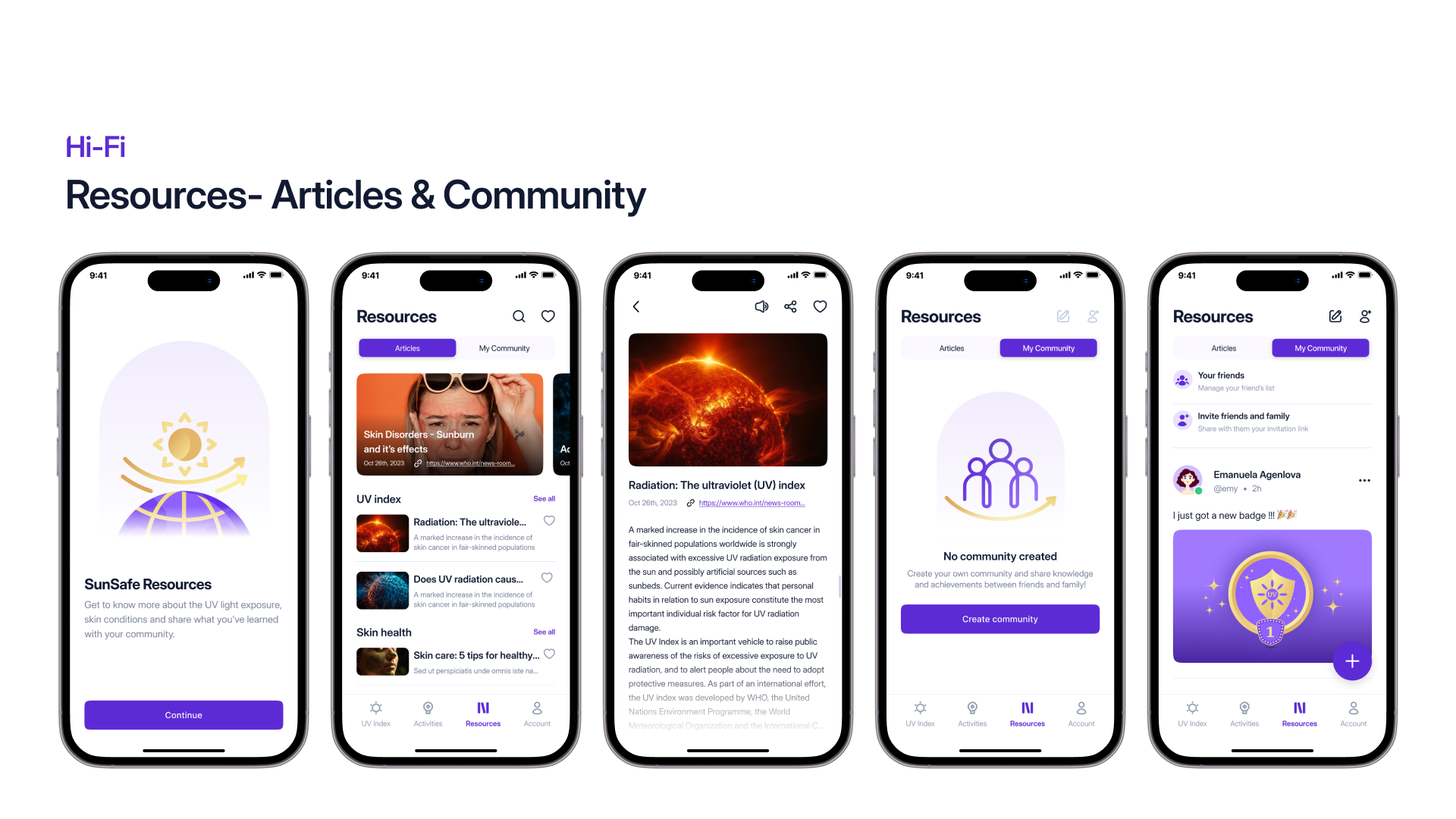
Resources
Account
The core flows
Four flows were drawn out in full before any visual design started, each one tracing a path a persona would actually take.
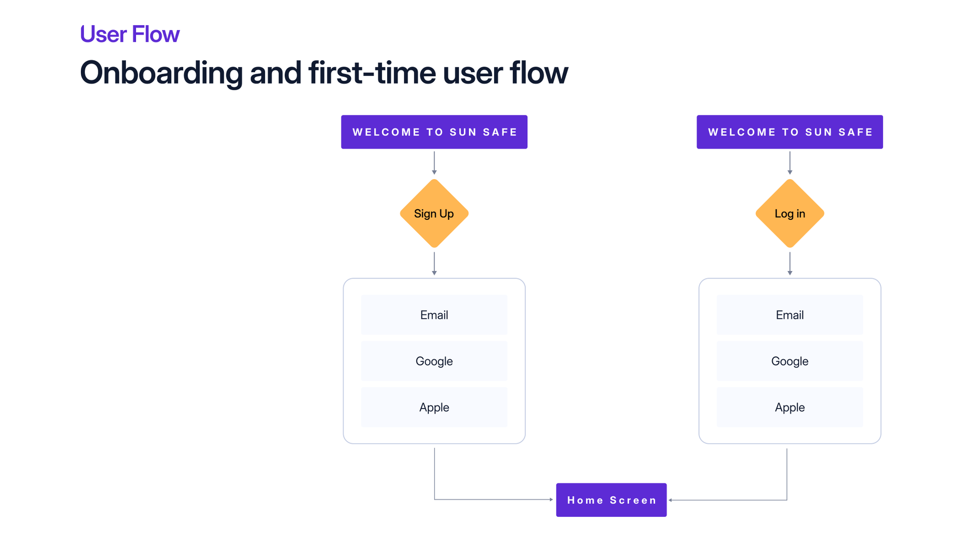
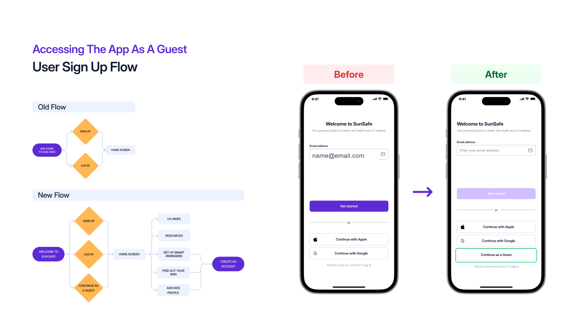
Two ways in, both landing in the same place.
Sign up or log in, each offering email, Google or Apple.
Both routes end on the home screen, so the choice never holds anyone up.
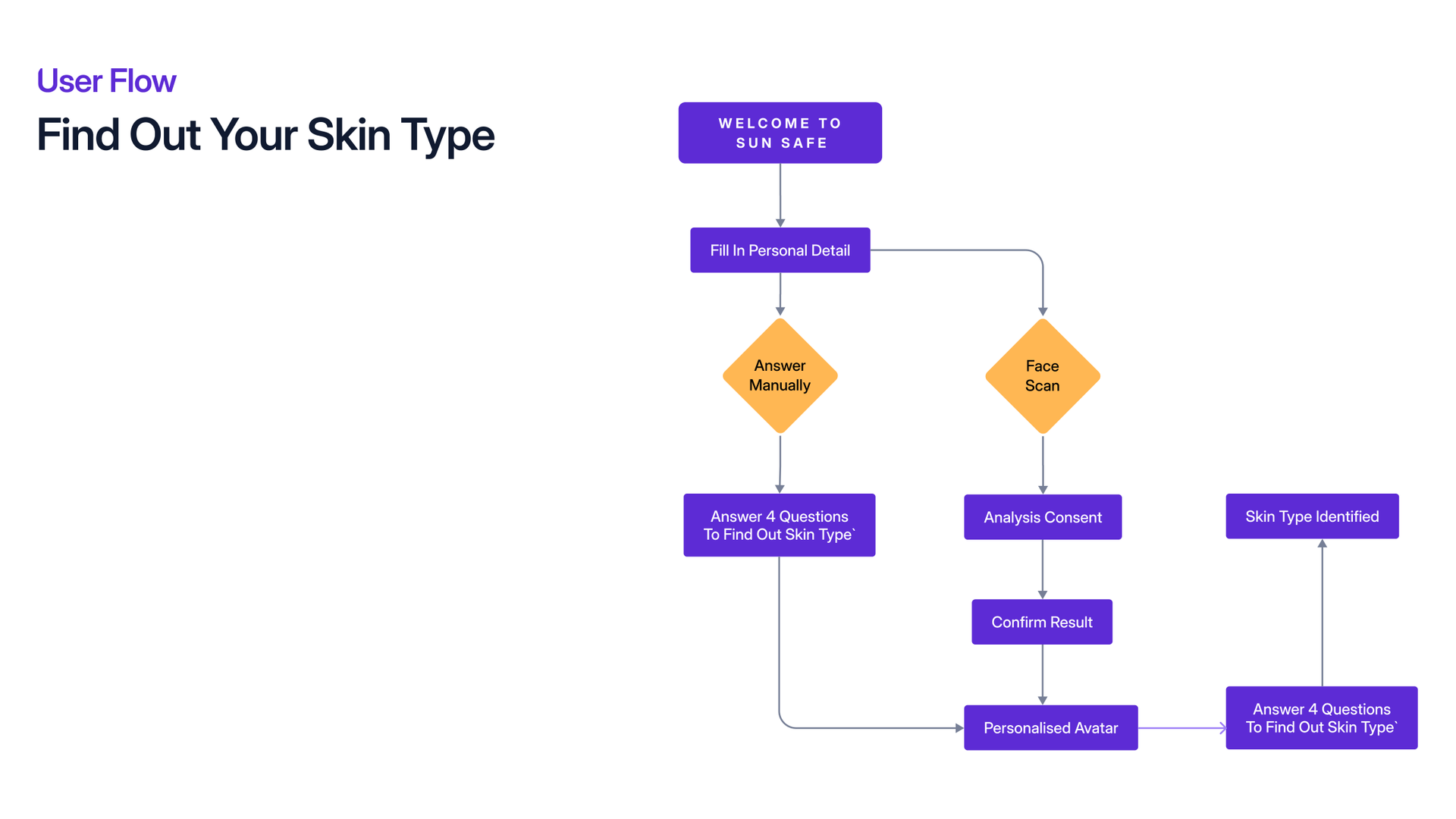
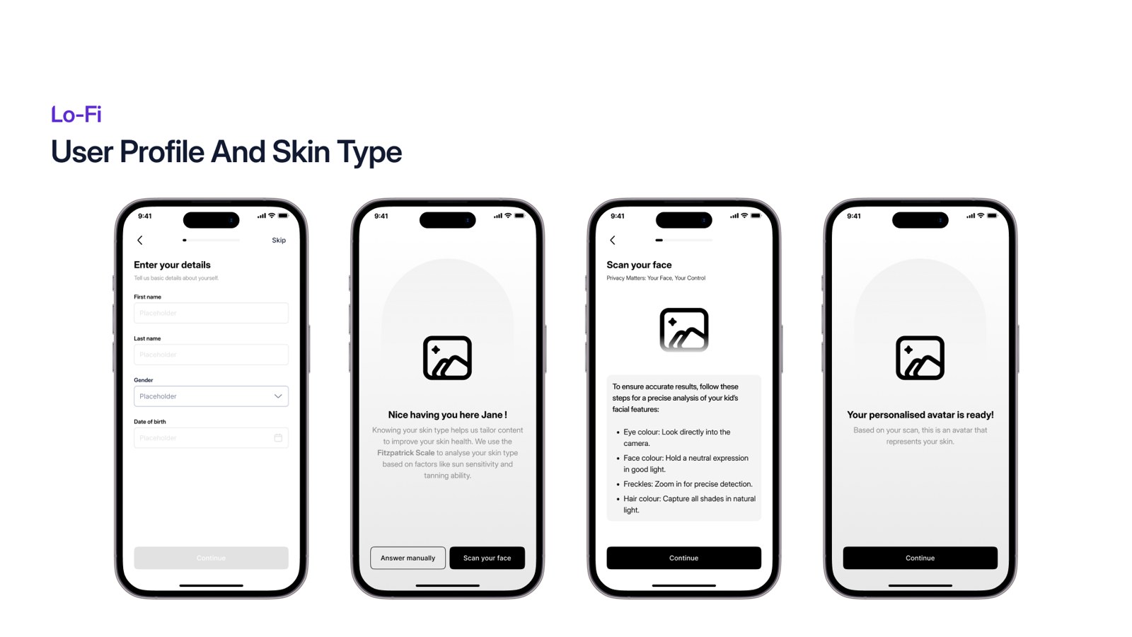
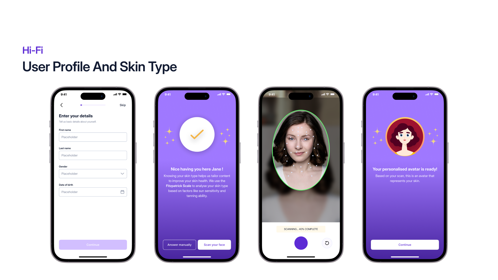
Personal details first, then a choice of two routes to the same answer.
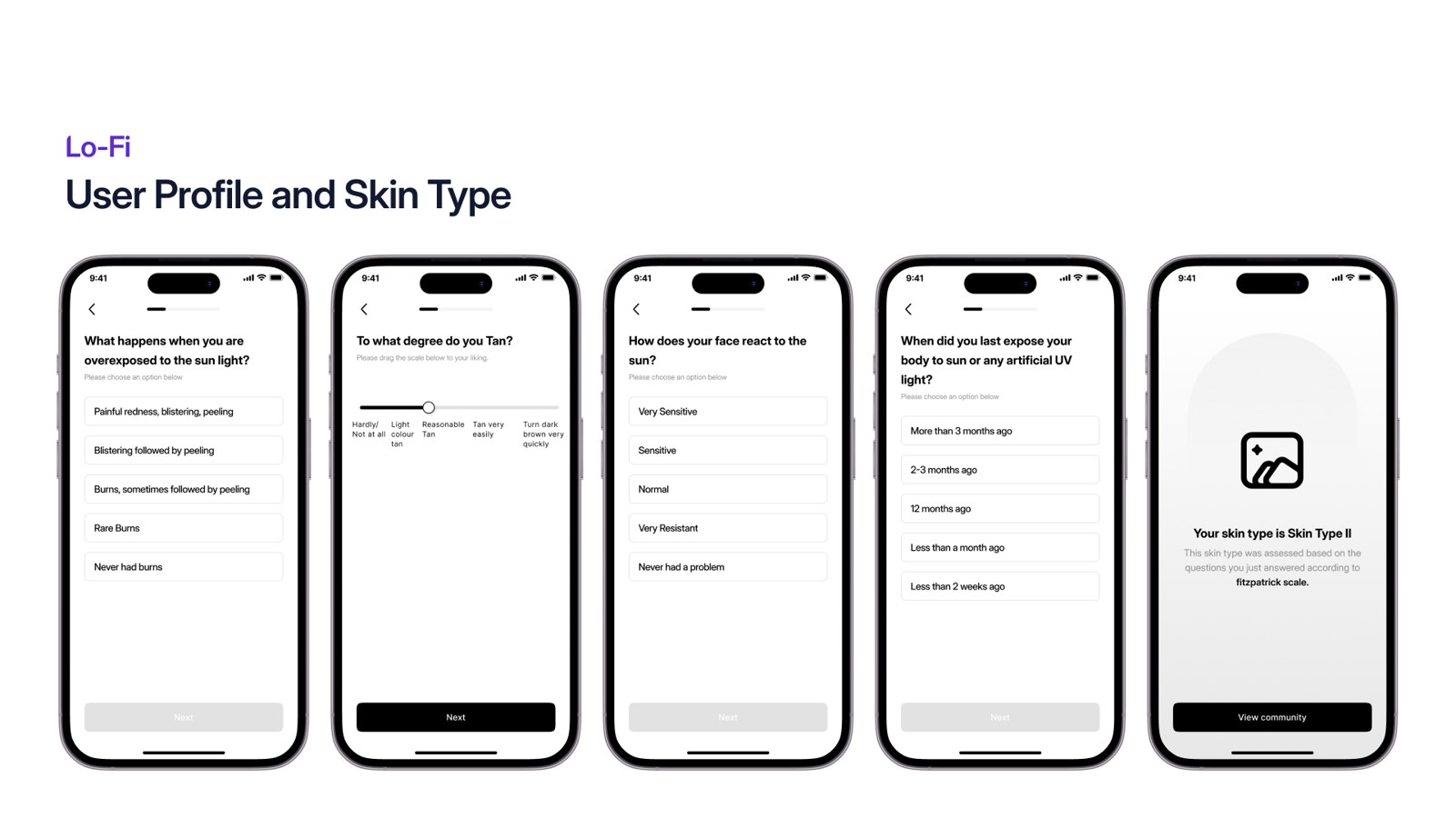
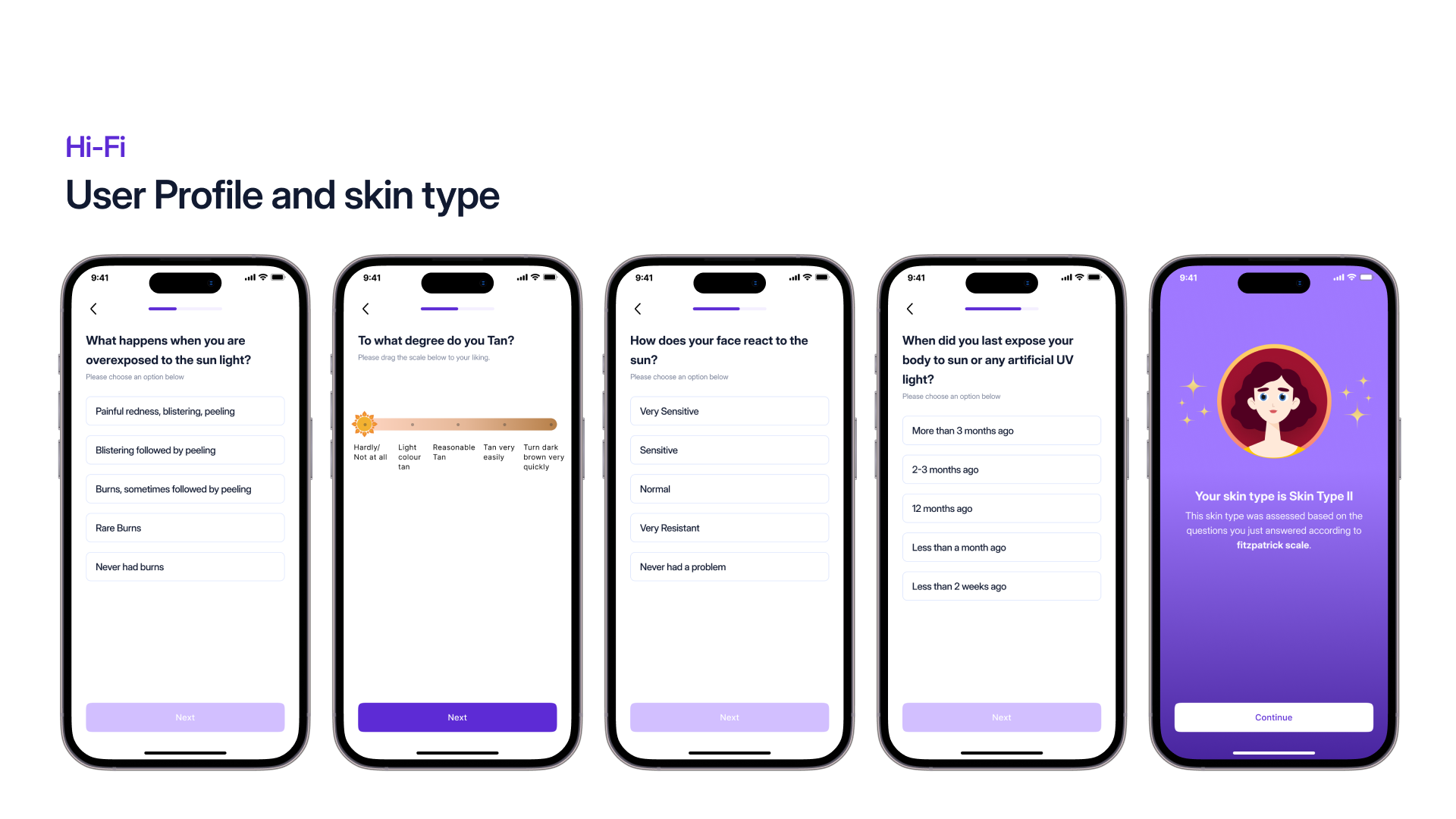
Answer manually, four questions that identify the skin type.
Or run a face scan, which asks for analysis consent first, then confirms the result.
Either route ends in a personalised avatar and an identified skin type.
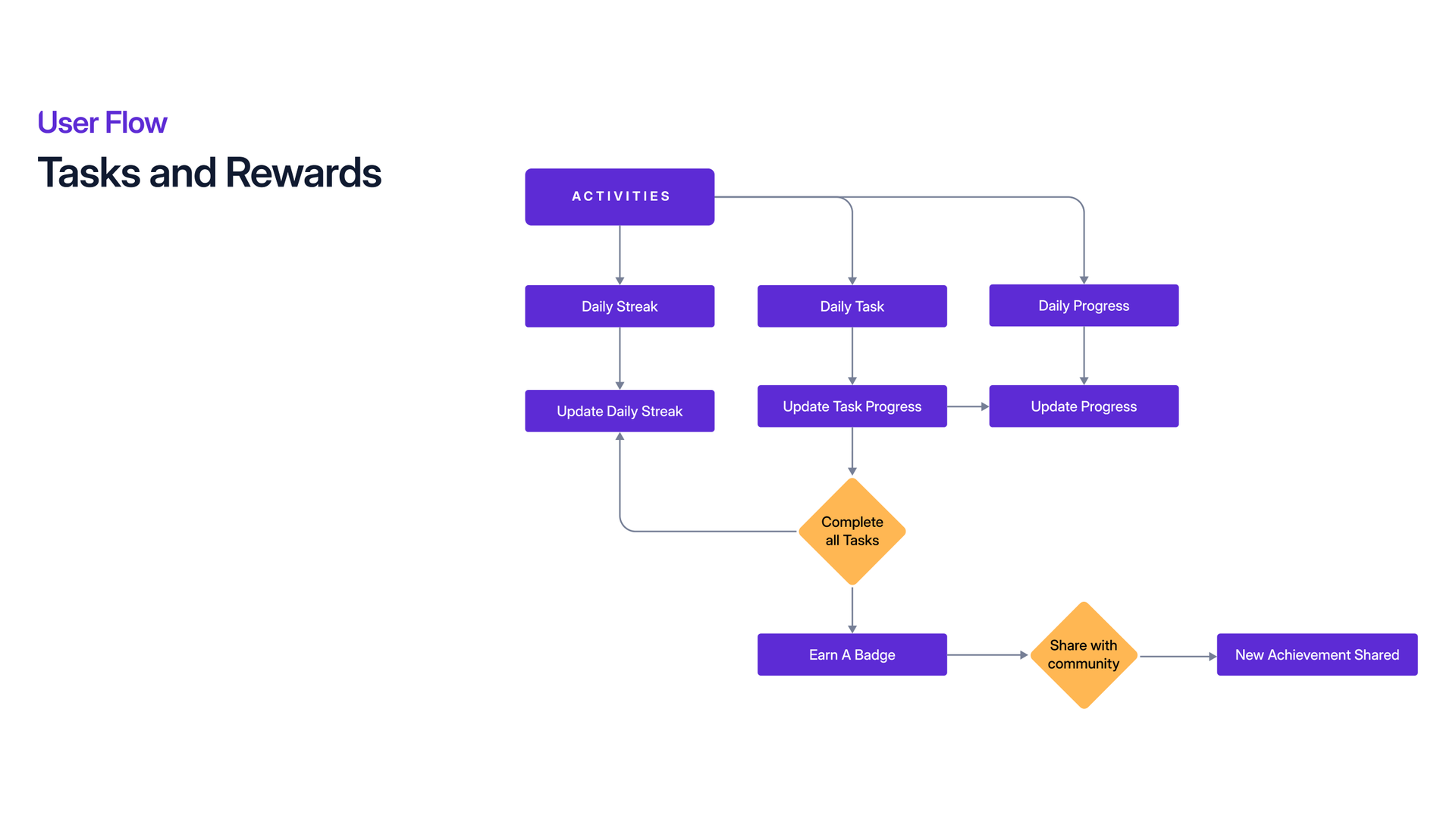
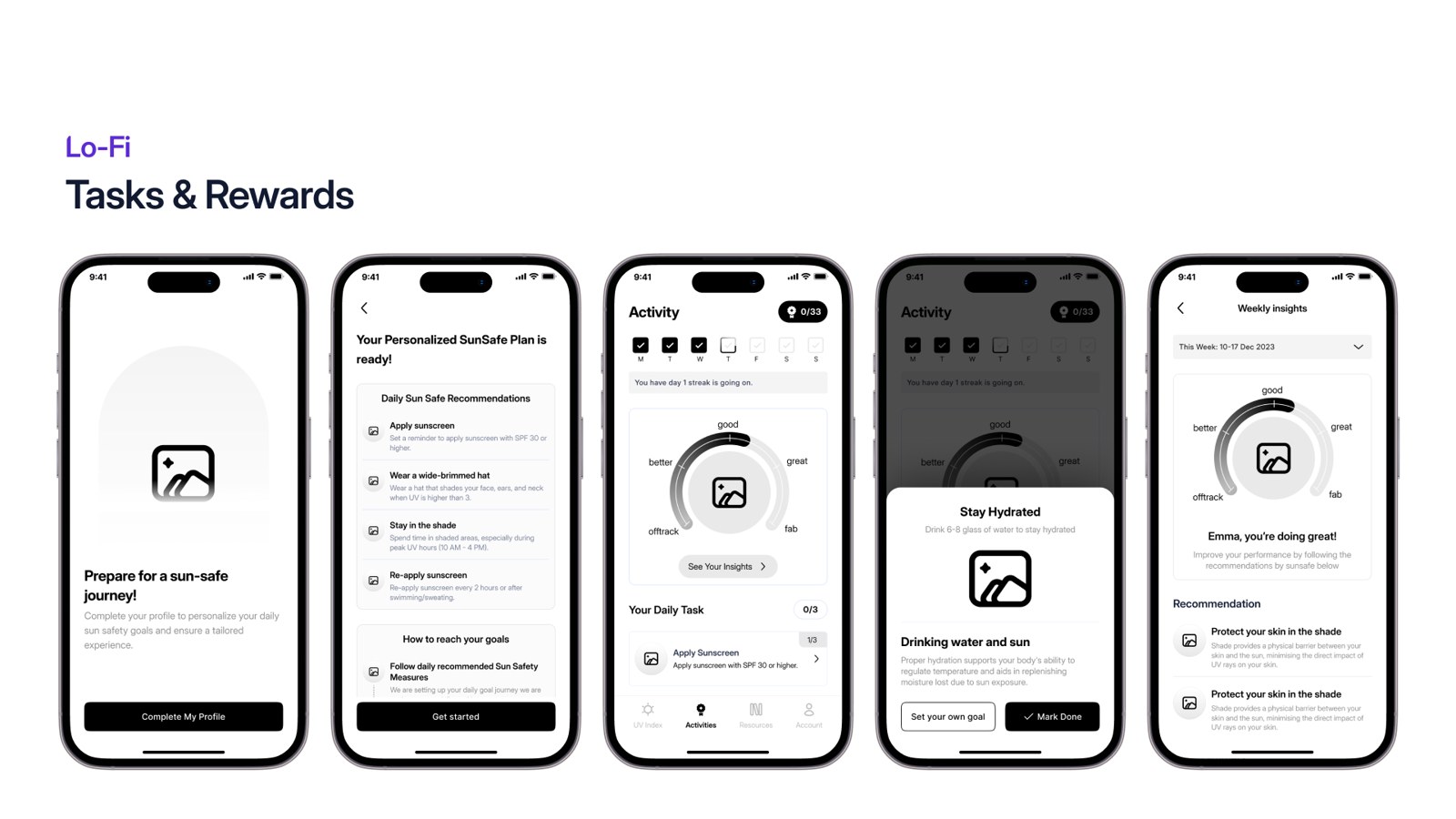
Activities carries the daily task, the progress and the streak together.
Updating a task moves the daily progress and the streak at the same time.
Completing every task earns a badge.
Badges can be shared with the community as a new achievement.
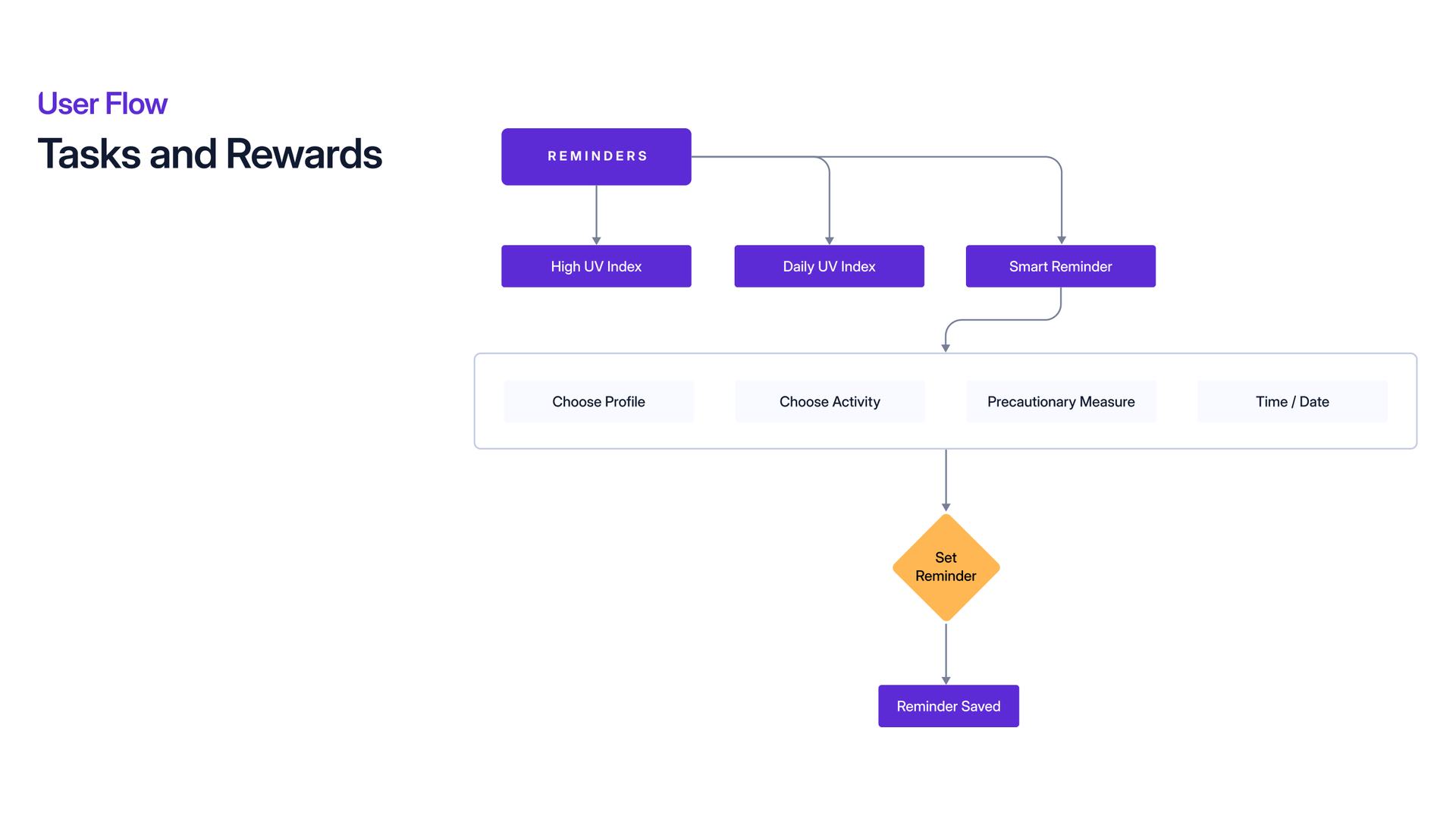
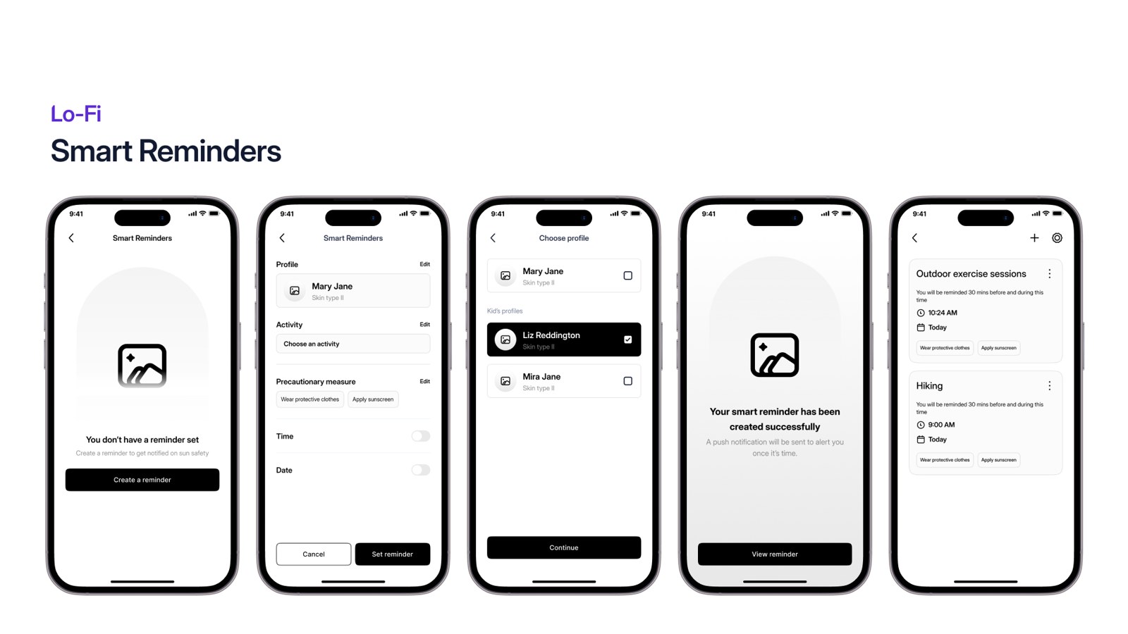
A reminder can start from the UV index or from an activity.
A high UV index or the daily UV index can trigger a smart reminder.
Choose the profile, the activity, the precautionary measure, and the time and date.
Setting it saves the reminder against that profile.
Colour and type
Sun Gold
#F5A623
Deep Orange
#D97706
Royal Purple
#6A0DAD
Deep Purple
#4C1D95
Dark Void
#1A1208
Paper
#FBF9FF
Inter and Inter Display, a clear, accessible hierarchy.
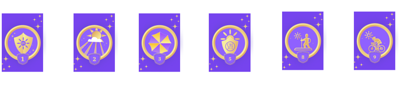
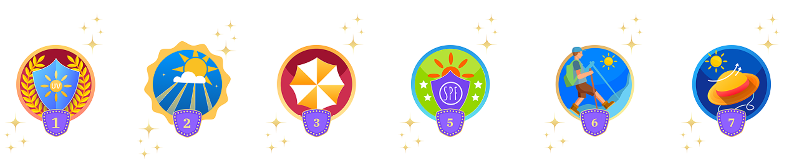
Badges, from purple to colourful
The first badge library shared one purple, gold-embossed look, so nothing felt distinctly earned and the key element got lost on the gradient. The finals became flat and colourful, each carrying its own sun-safety element.
Lo-fi first
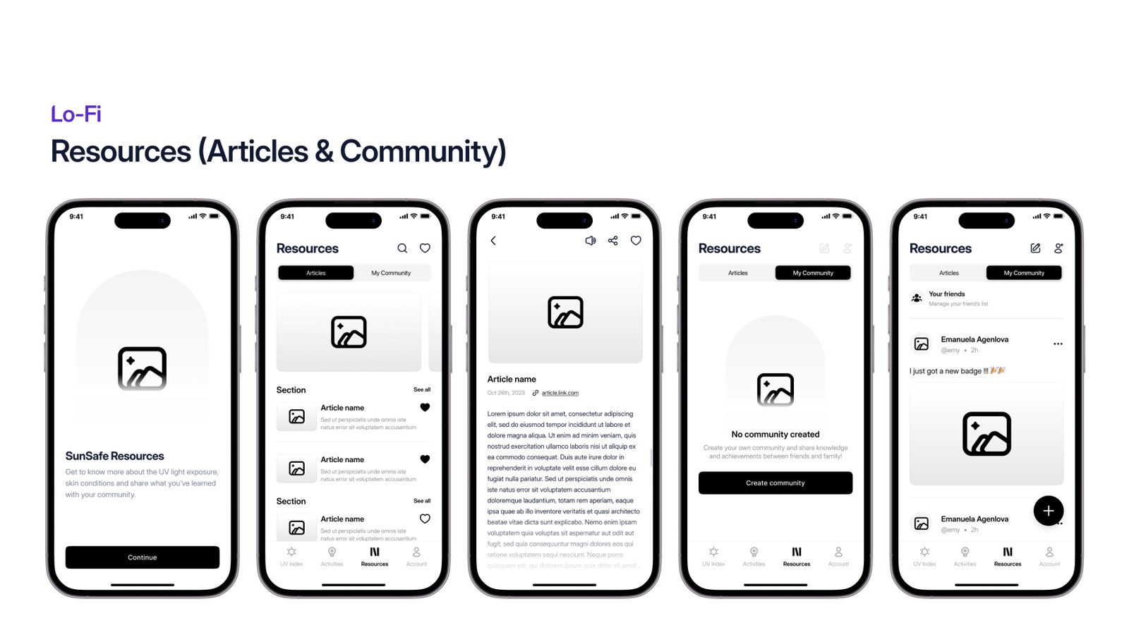
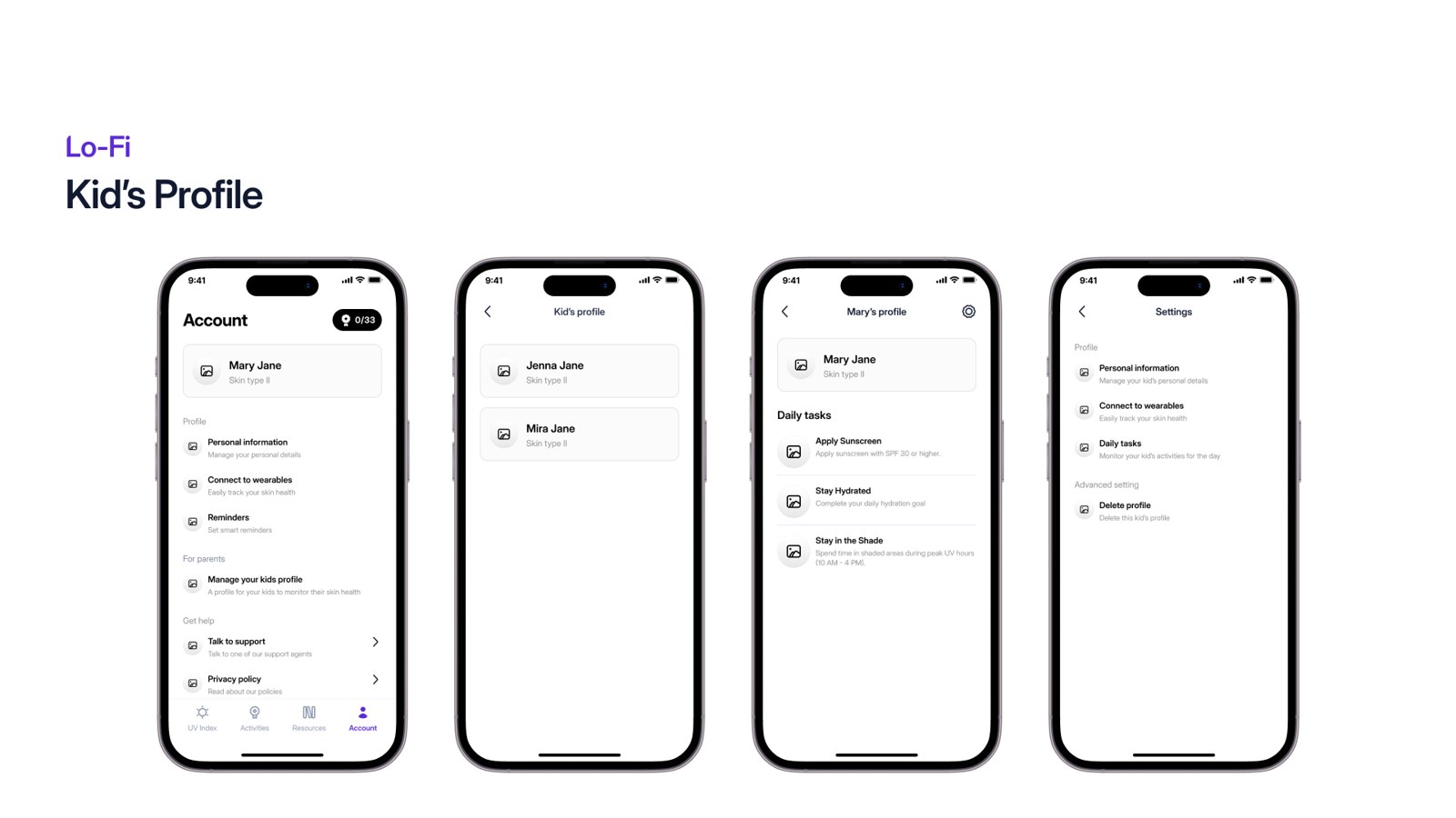
Before any visual design, I wireframed every core flow in low fidelity, skin-type onboarding, tasks and rewards, resources, smart reminders and kids’ profiles, to settle structure and content ahead of the hi-fi screens.
Then the real thing
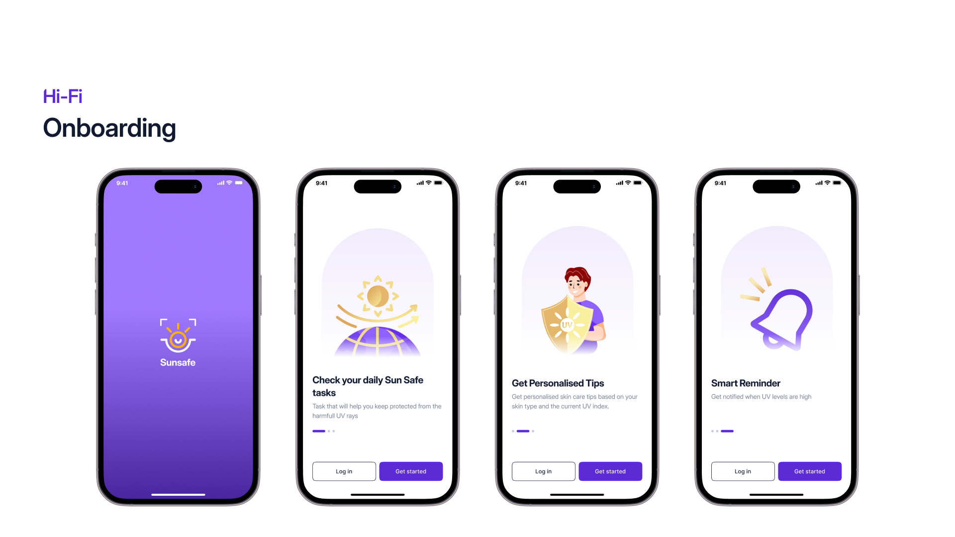
Every high-fidelity screen from the SunSafe prototype, grouped by flow.
What I tested
Seven participants ran through the core flows. I measured the experience with a 10-question System Usability Scale and evaluated every screen against Nielsen’s heuristics, then A/B-tested the fixes.
The SUS score
Well above the 68-point industry average, placing SunSafe’s usability in the “good / B-grade” band. The chart shows the spread of responses across all ten SUS questions (Q1-Q10).
Before and after
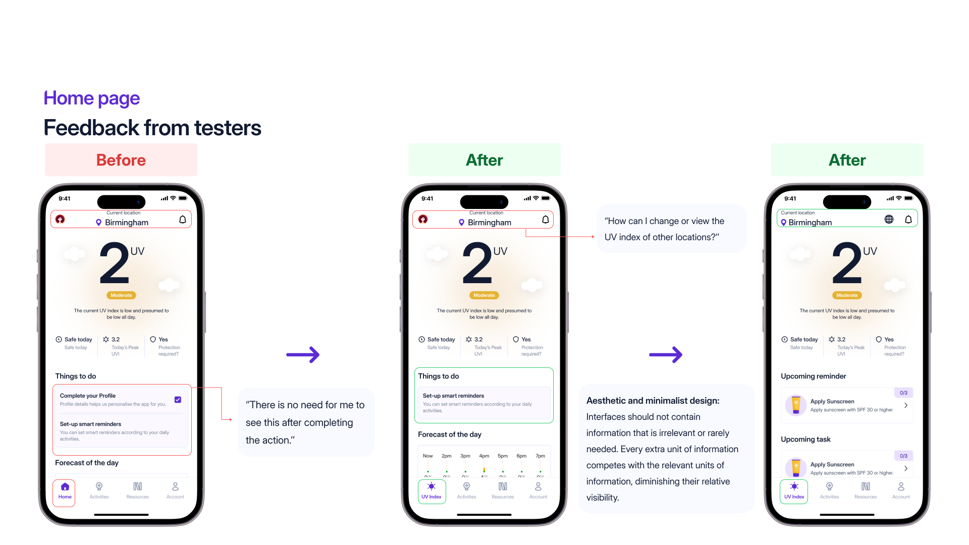
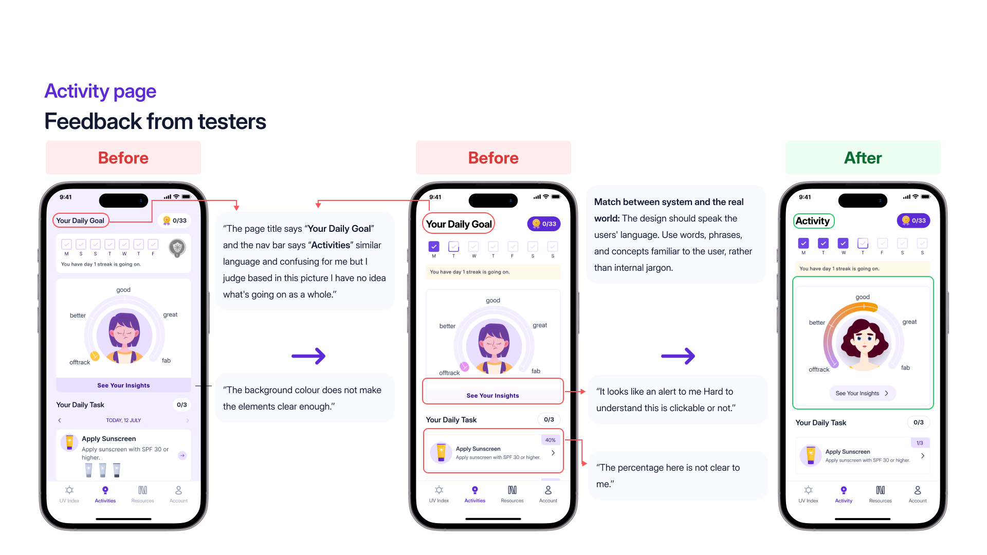
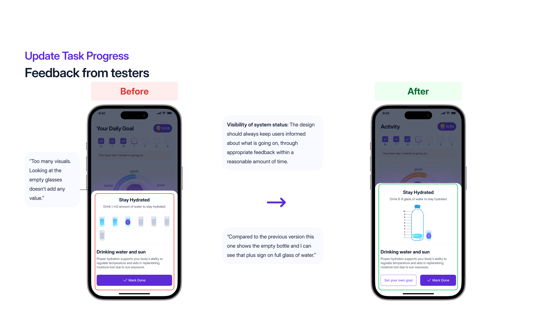
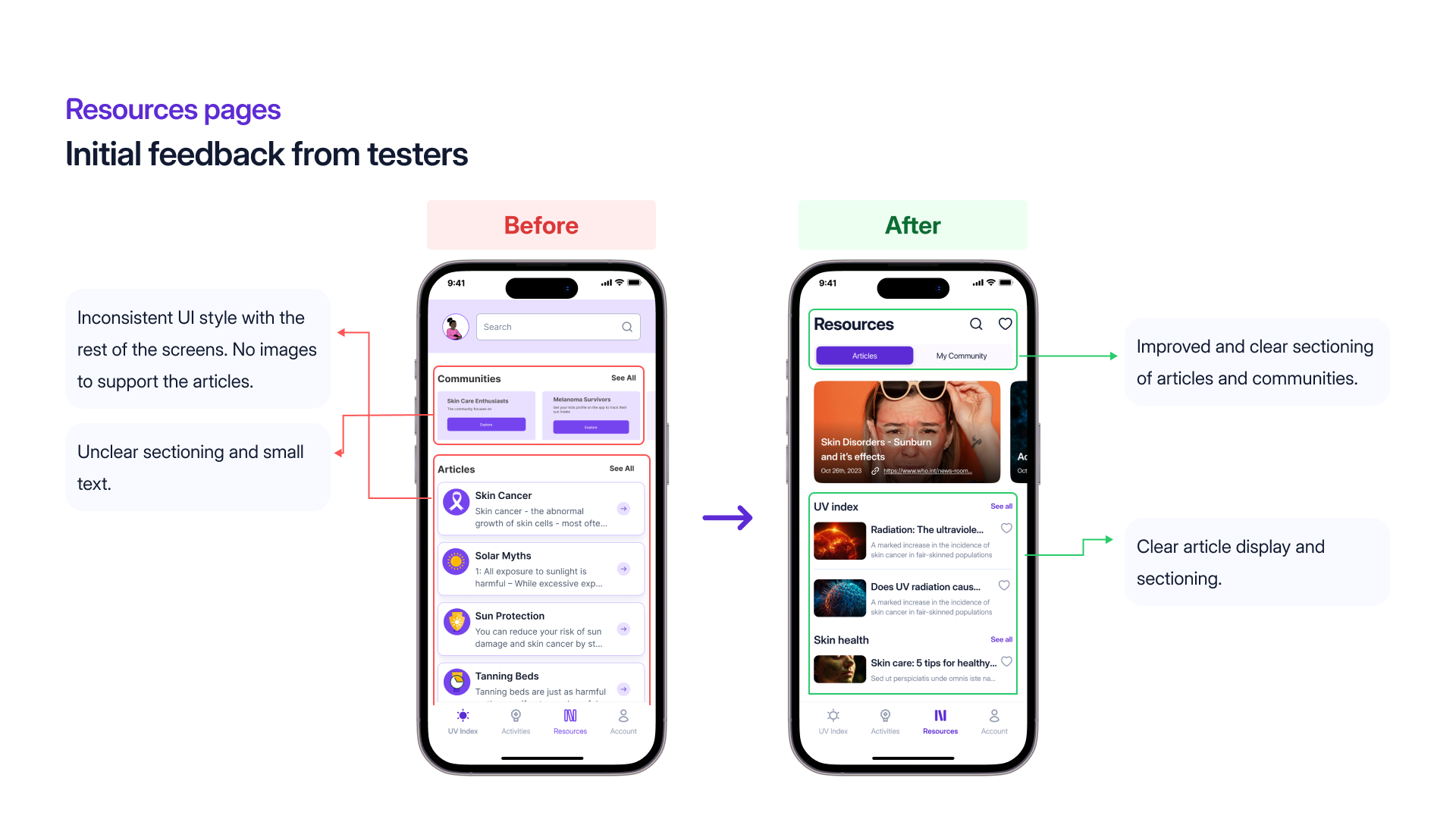
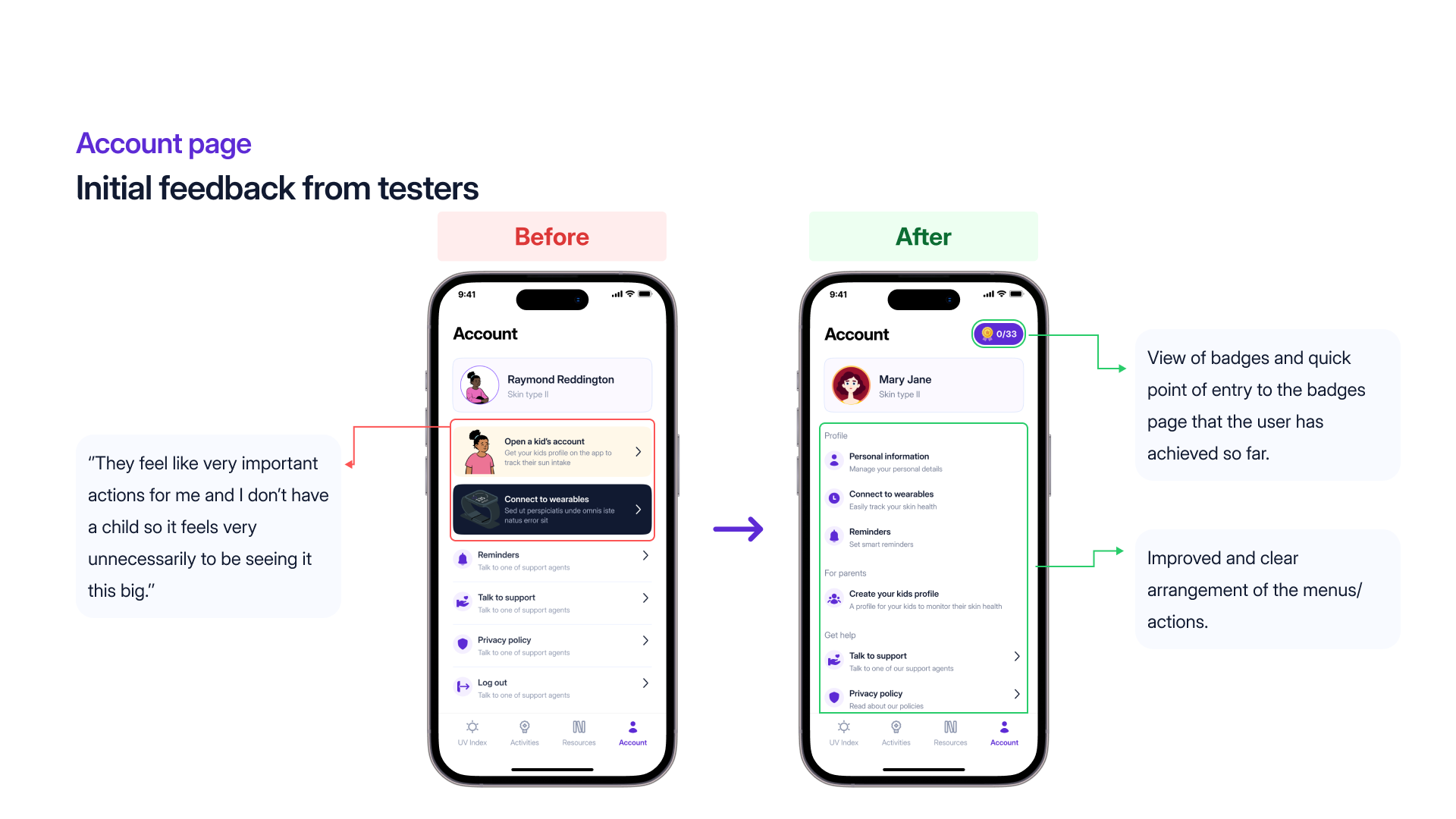
Seven flows testers stumbled on, redesigned from their feedback. Their own words drove every change.
The page title says “Your Daily Goal” and the nav bar says “Activities”, similar language and confusing for me.Activity page
They feel like very important actions for me and I don’t have a child, so it feels very unnecessary to be seeing it this big.Account page
Too many visuals. Looking at the empty glasses doesn’t add any value.Task progress
It looks like an alert to me. Hard to understand this is clickable or not.Activity page
How can I change or view the UV index of other locations?Home page
Compared to the previous version this one shows the empty bottle and I can see that plus sign on full glass of water.Task progress, after the redesign
What it delivered
A user-centred UV-protection experience grounded in behavioural science.
An accessible, inclusive interface validated with colour-blind users.
Gamification integrated into genuine health habits, not vanity metrics.
Usability validated through testing and a 76.1 SUS evaluation.
Where SunSafe goes from here
Environmental sensors
Connect to external accessories that read altitude, pollution and weather conditions, for a fuller picture of UV exposure risk than location alone can give.
Augmented reality
Overlay the live UV index on the user’s surroundings through the camera, so people can see which spots carry more risk before they pick where to sit or stand.
Siri shortcuts
Voice control for smart reminders, so someone can say “Hey Siri, set a smart reminder” without opening the app at all.
Reflection
SunSafe sharpened how I balance engagement with simplicity, designing behaviour-driven health experiences that stay accessible to genuinely diverse users.
Sources and further reading