Terminal navigation
Multi-level, complex airport hubs are hard to navigate.
NAVLINGO is an AR navigation and real-time translation system for airports, transit hubs and cities. It overlays directional guidance, translated signage, live speech captions and contextual point-of-interest info directly into the traveller’s view, so they never have to look down at a phone in a crowded, unfamiliar space. It spans three surfaces: AR glasses as the primary interface, a companion mobile app, and a smartwatch for discreet alerts.
A walkthrough of the AR navigation and real-time translation experience.
Why it matters
Travellers routinely struggle inside large terminals, with inaccessible signage and confusing airport systems. Existing phone navigation forces users to look down, disorienting and unsafe in crowded spaces.
Five pain points
Terminal navigation
Multi-level, complex airport hubs are hard to navigate.
Language barriers
Foreign signs, menus and spoken announcements are unreadable.
Accessibility deficits
Little audio / visual support for low vision or low tech literacy.
Visibility & glare
Outdoor and indoor glare make phone screens hard to read.
Travel stress
Last-minute gate changes and lost luggage cause anxiety.
How might we
The gap in the market
We benchmarked the leading AR/VR platforms. Each nails part of the spatial experience, but none combines real-time travel navigation, live translation and full accessibility, the gap NAVLINGO targets.
| Capability | 01Apple Vision Pro | 02Meta Quest Pro | 03HoloLens 2 | 04NAVLINGO |
|---|---|---|---|---|
| Real-time indoor / outdoor navigation | Limited | Limited | Limited | |
| Live sign translation (eye-gaze) | ||||
| Airport flow, boarding pass & gate sync | ||||
| Full WCAG 2.1 AA accessibility | Partial | Partial | Partial | |
| Eye-gaze interaction | ||||
| IoT baggage tracking (RFID / beacon) | ||||
| Consumer travel focus |
Size of circle = level of support
Key technical challenges
Field of view, tunnel vision
Consumer AR glasses offer only 40-50° FOV. Mitigated with waveguide-optics research and gaze-adaptive UI scaling.
Outdoor brightness
Targeted 10,000+ nits (Lumus / DIGILENS modules) so overlays stay legible in daylight.
Vergence-accommodation conflict
Depth-focused, multifocal optical design to reduce eye strain over long sessions.
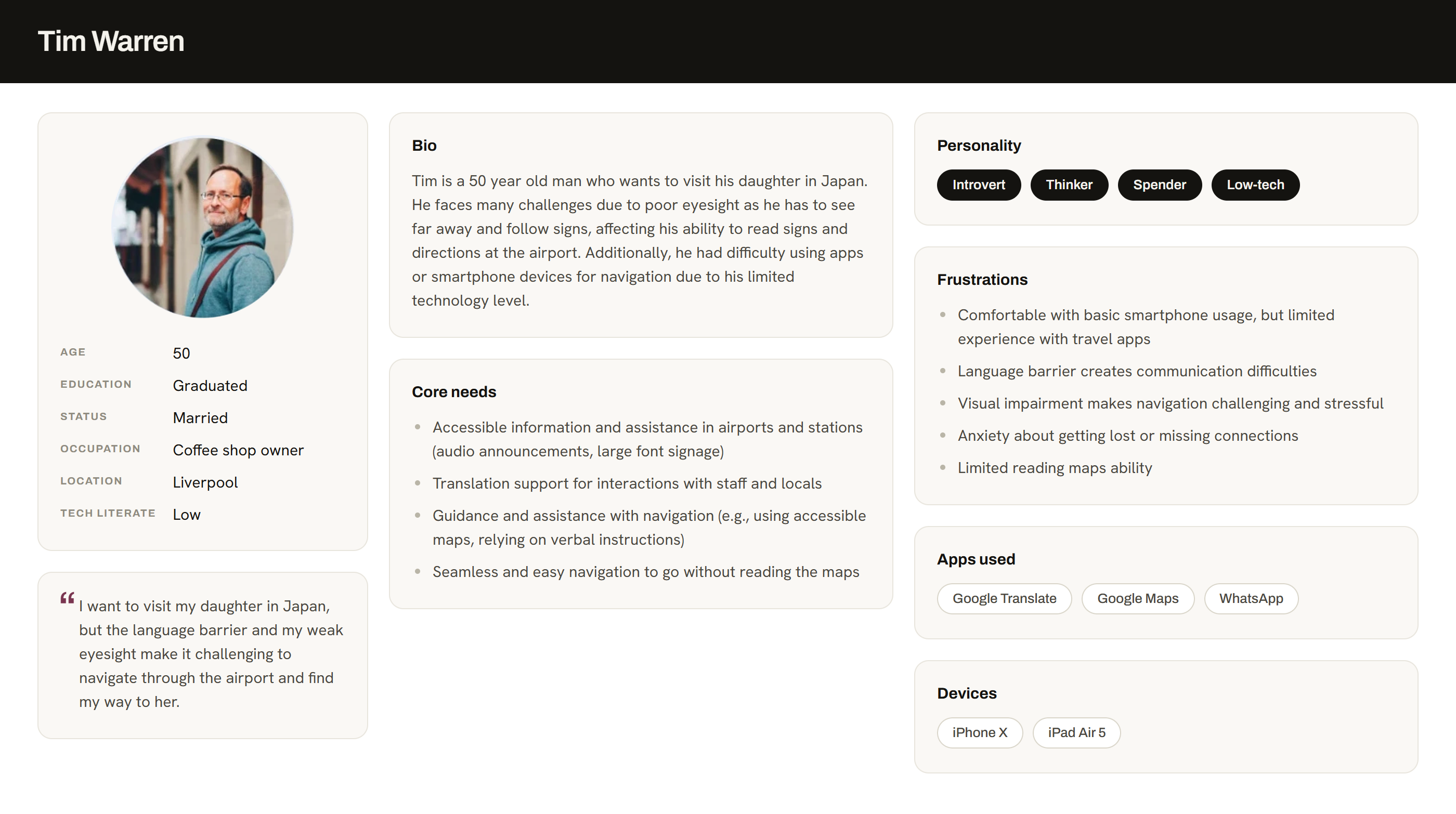
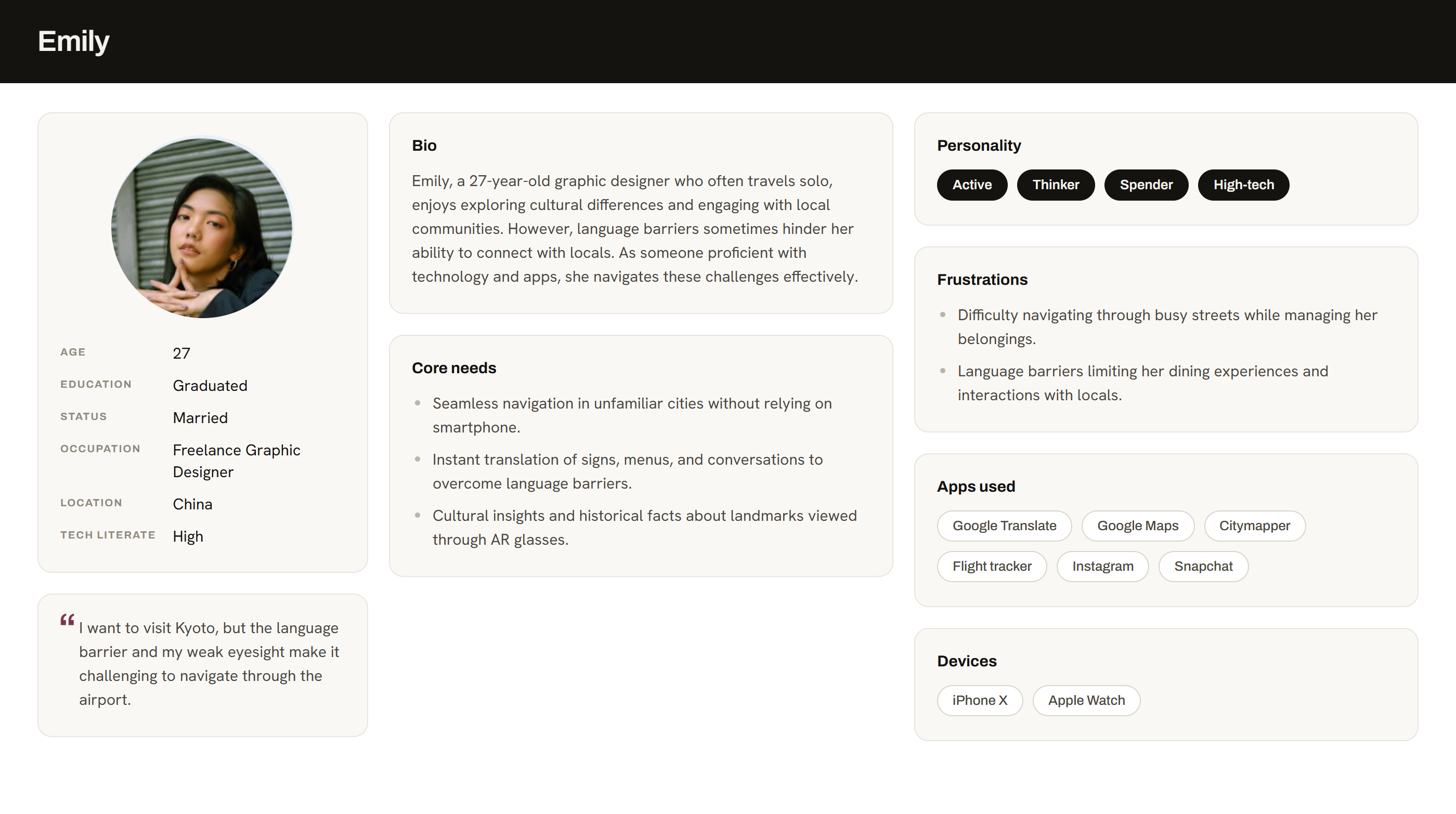
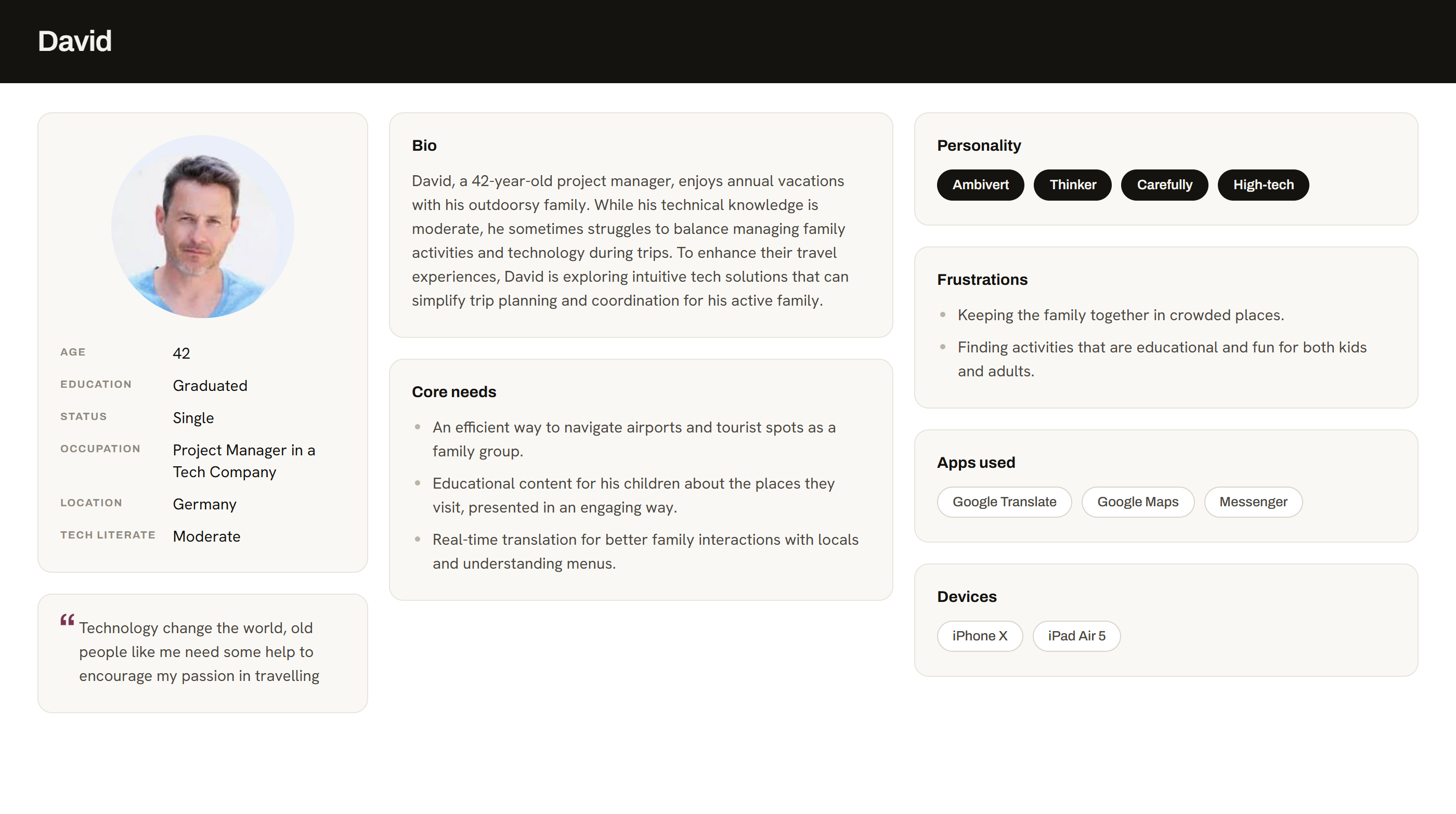
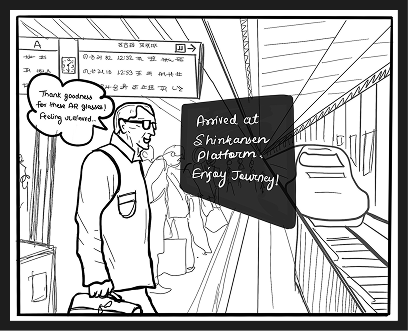
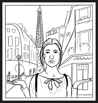
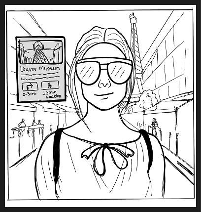
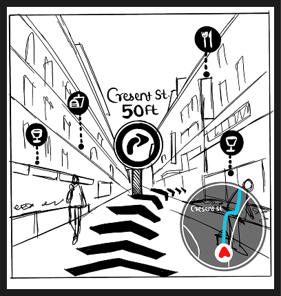
Built from research into who struggles most with travel, an older low-vision traveller, a tech-savvy solo explorer, and a parent managing a family.
Between them they cover the full span of tech literacy, which is what forced the hands-free controls and the accessibility work. Tim cannot read the signage, Emily has both hands on her luggage, and David is tracking three people at once.
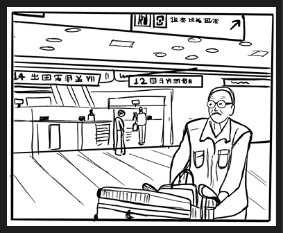
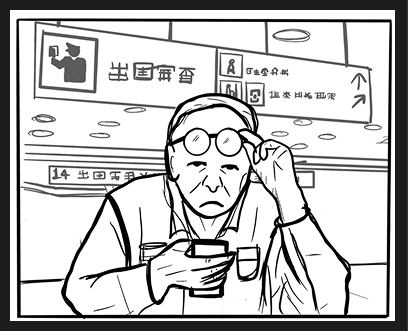
Tim, limited eyesight

Emily, solo explorer
David, family vacation planner
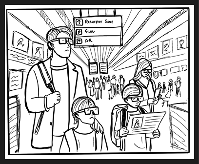
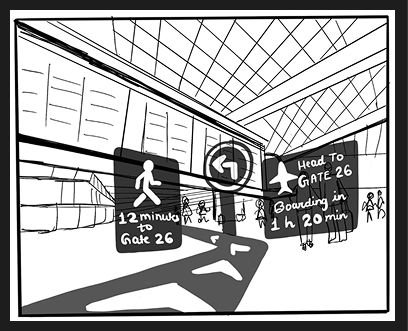
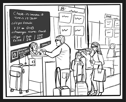
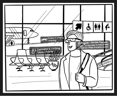
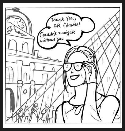
Each persona was storyboarded through a real journey, four frames from the moment the trip starts to the moment it is done.
Storyboarding before any interface design is what surfaced the gate-change alert, the baggage hand-off and the moment a traveller needs translation while both hands are full.
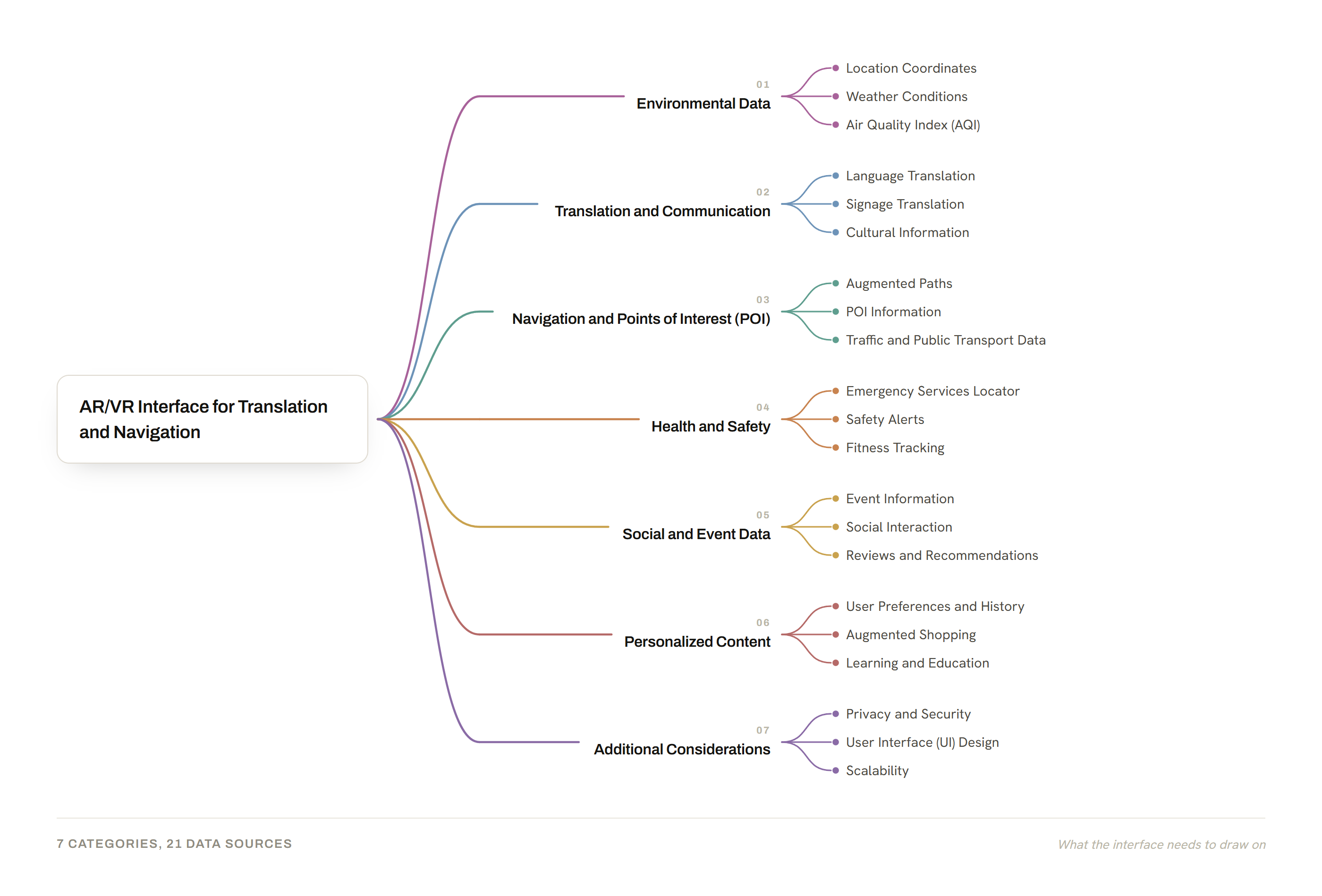
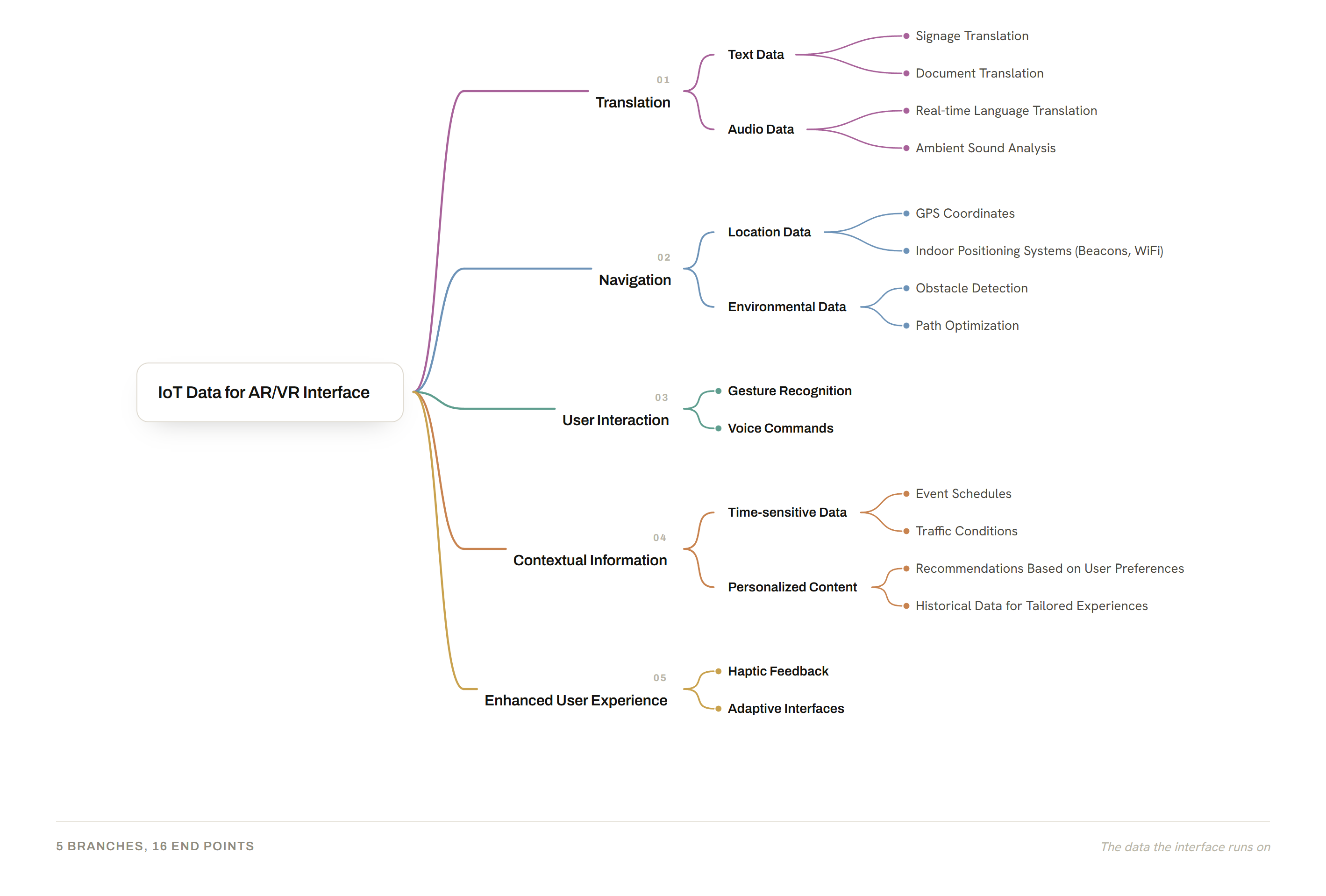
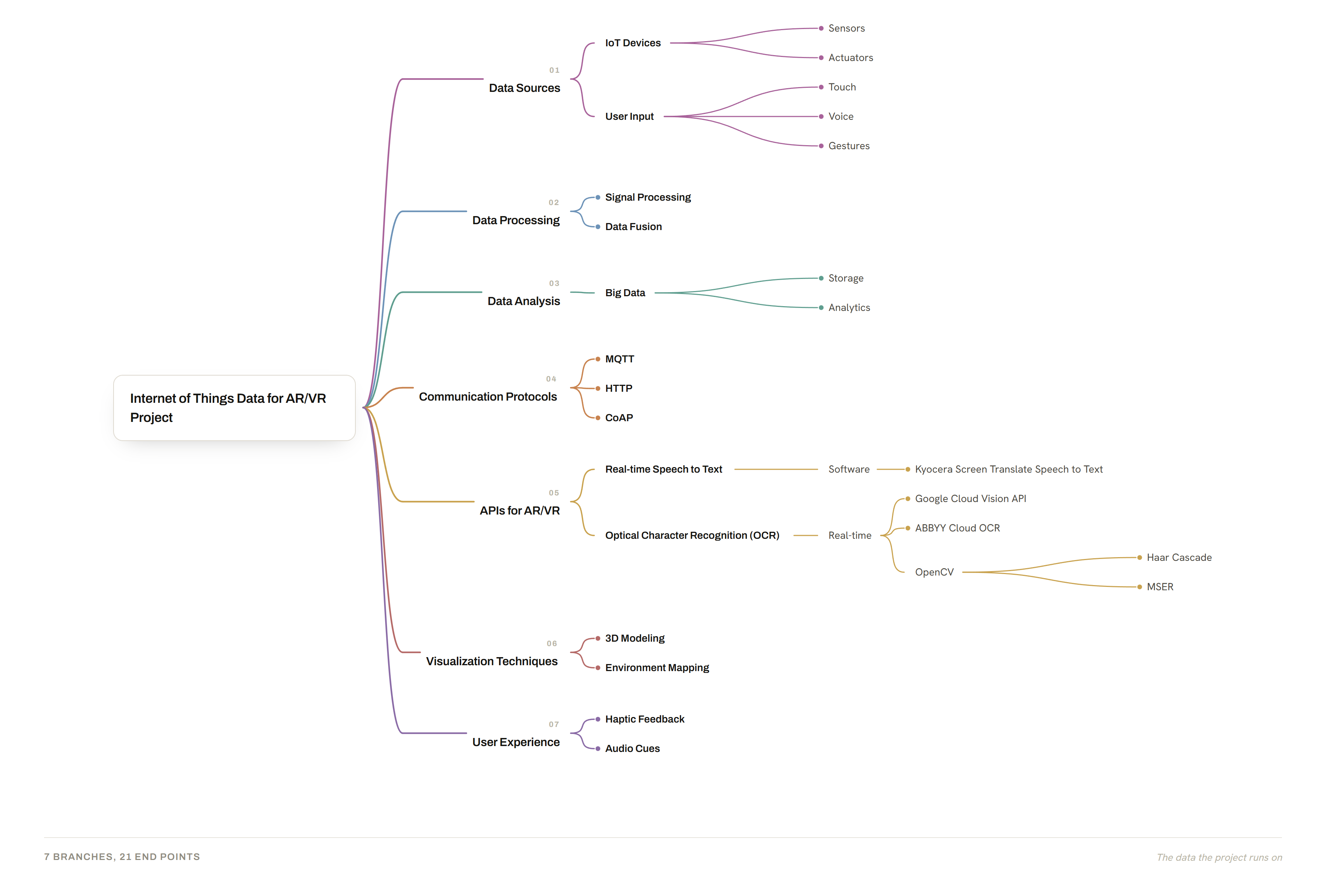
We began by mapping the whole opportunity space, AR/VR for translation and navigation, and the IoT data that would feed it, before narrowing to the features worth building.
Three maps took the idea apart in turn: what the interface itself needs, the IoT data behind that interface, and the IoT data behind the project as a whole.
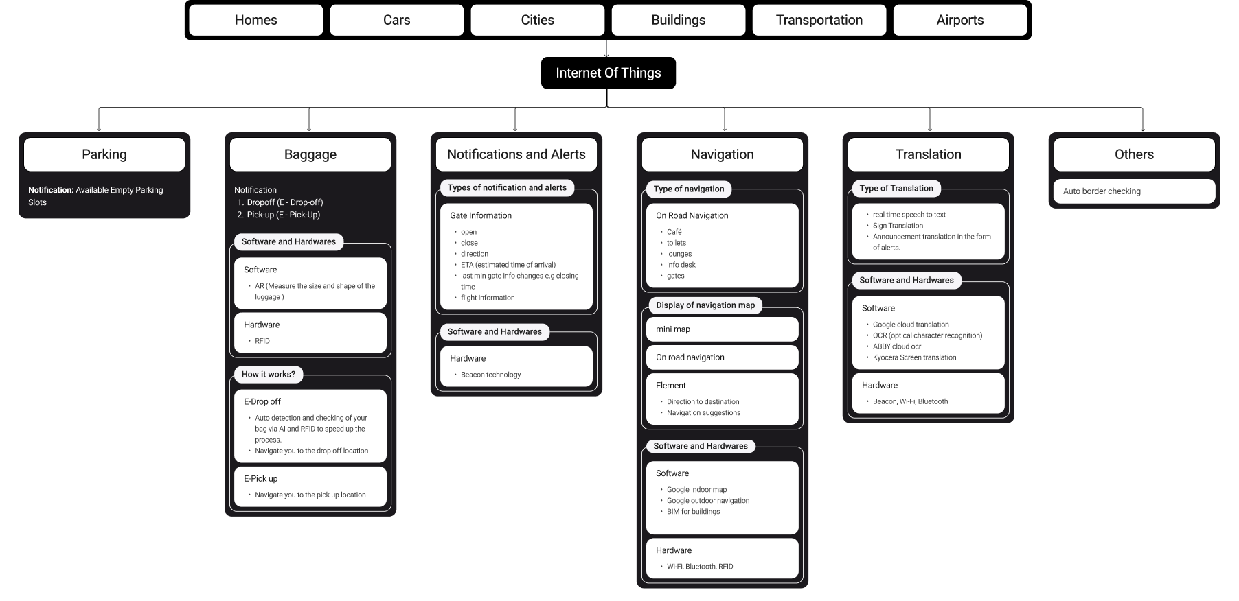
We mapped how IoT, navigation, translation and airport services connect across the AR, mobile and watch surfaces, then defined the core journeys.
Six domains hang off the one hub, and each carries its own capabilities and the software and hardware behind them. Everything the interface shows traces back to a source on this sheet.
Five core flows
Five journeys came out of that map, each one drawn end to end before any interface design started.
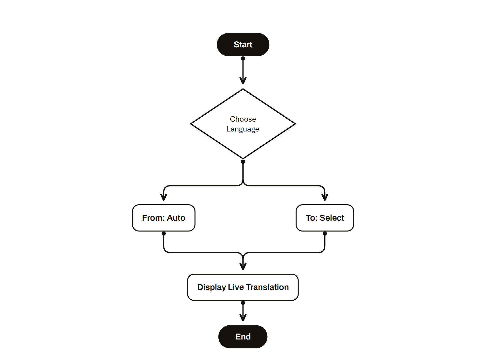
01
Choose language
From is auto-detected, To is selected
Display live translation
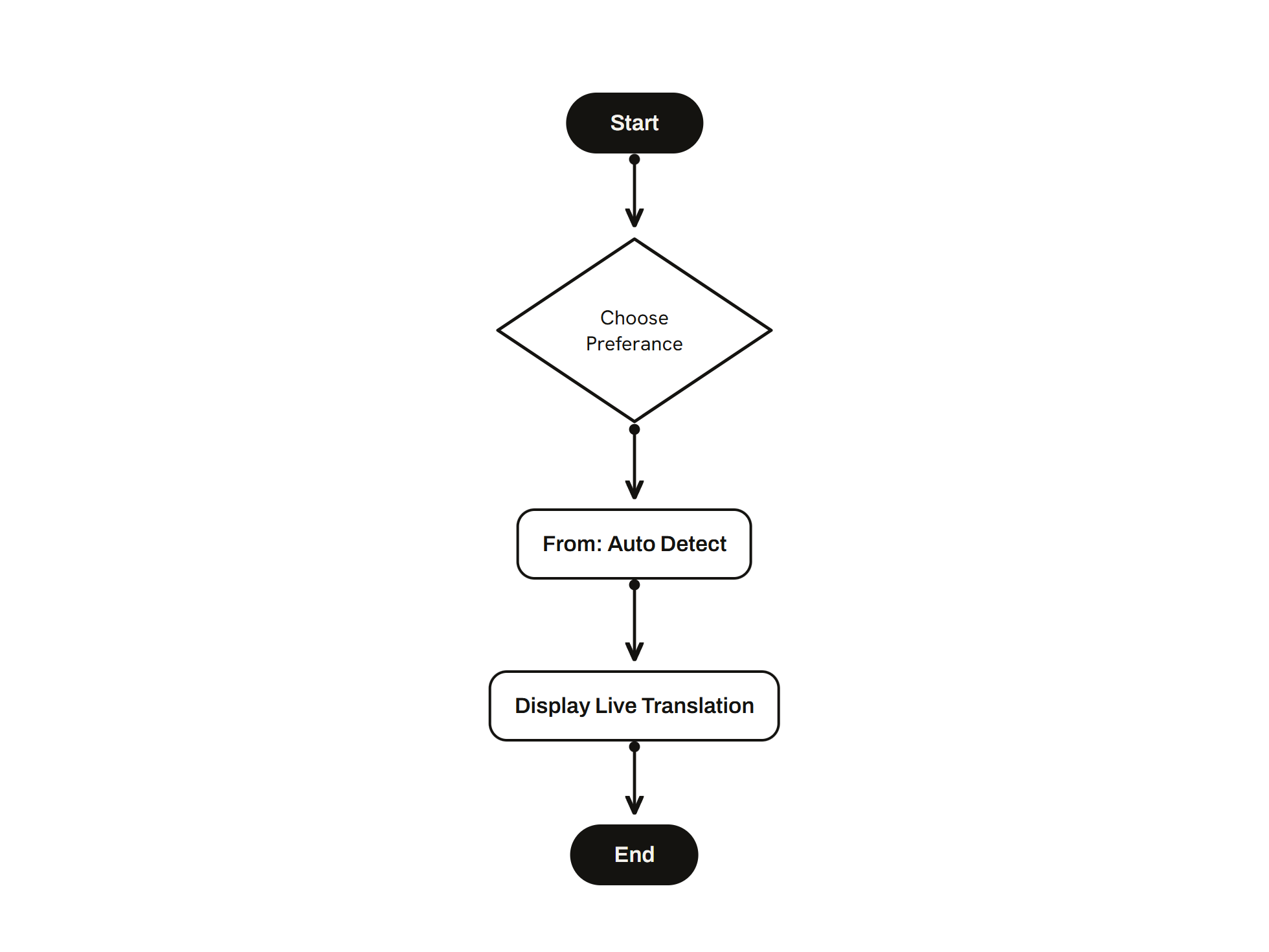
02
Choose preference
From: auto detect
Display live translation
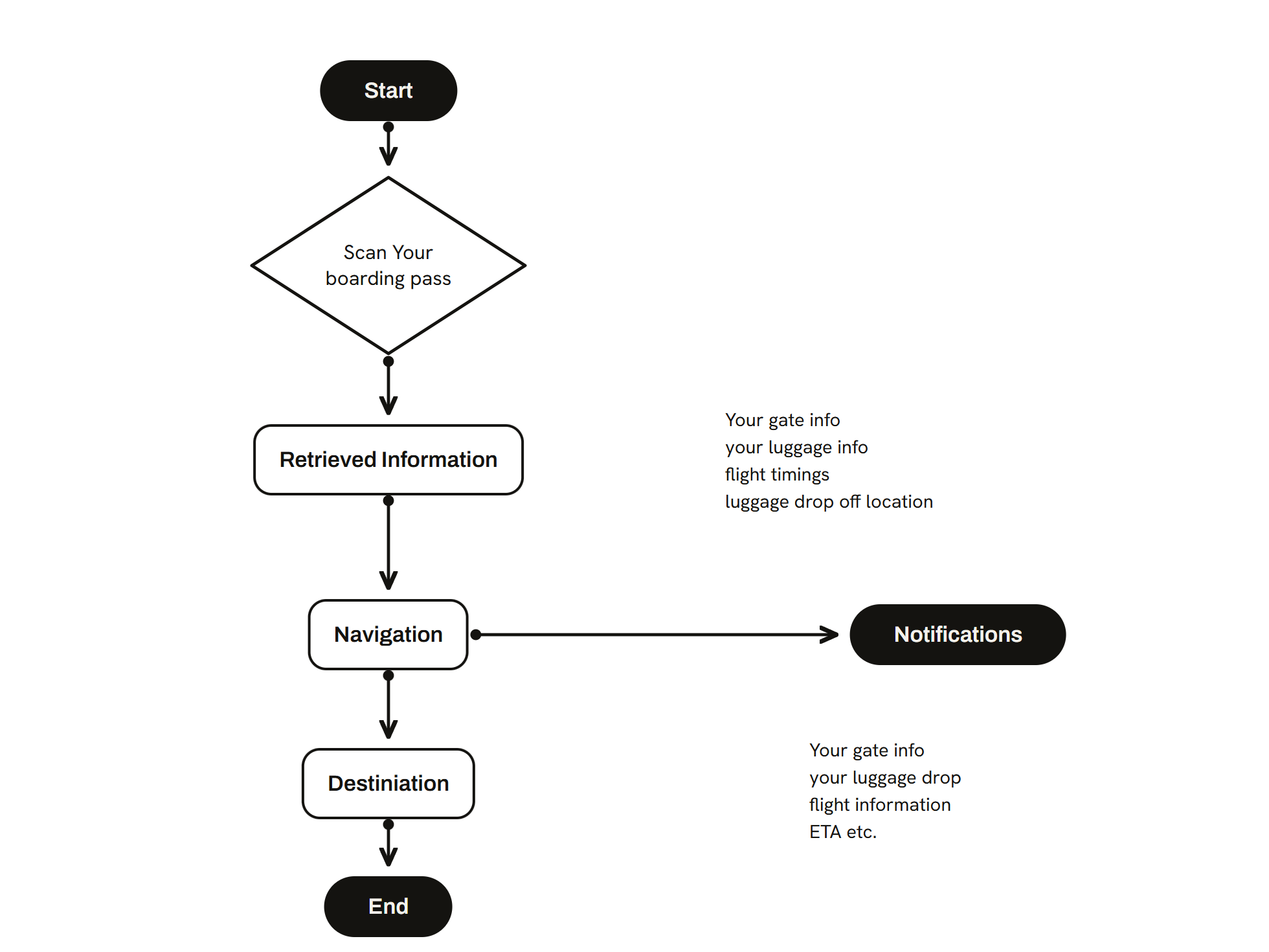
03
Scan your boarding pass
Retrieved information: gate, luggage, flight timings, drop-off location
Navigation, with notifications pushed alongside
Destination
04
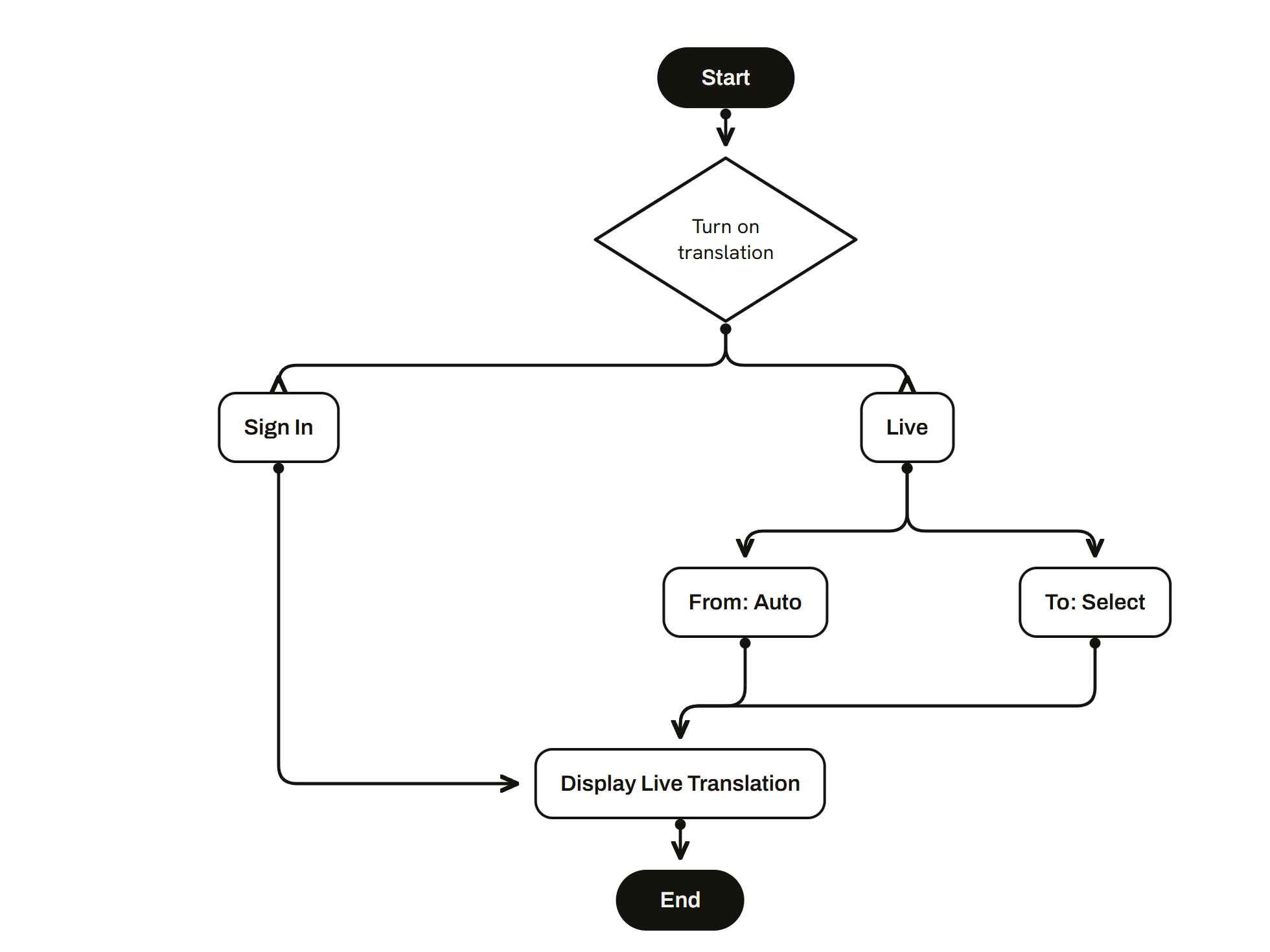
Turn on translation
Sign in, or go straight to live
From is auto-detected, To is selected
Display live translation
05
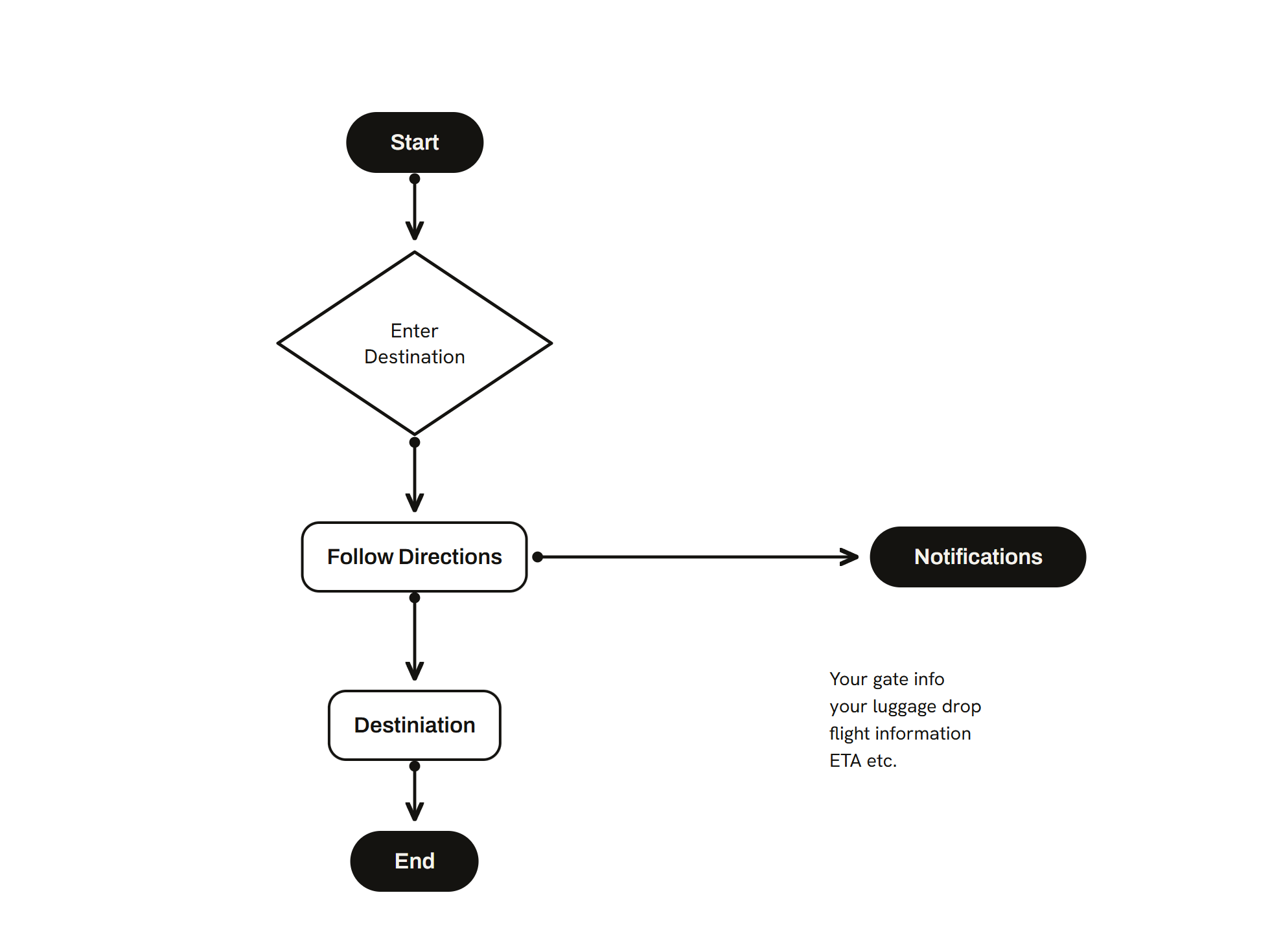
Enter destination
Follow directions, with notifications pushed alongside
Destination
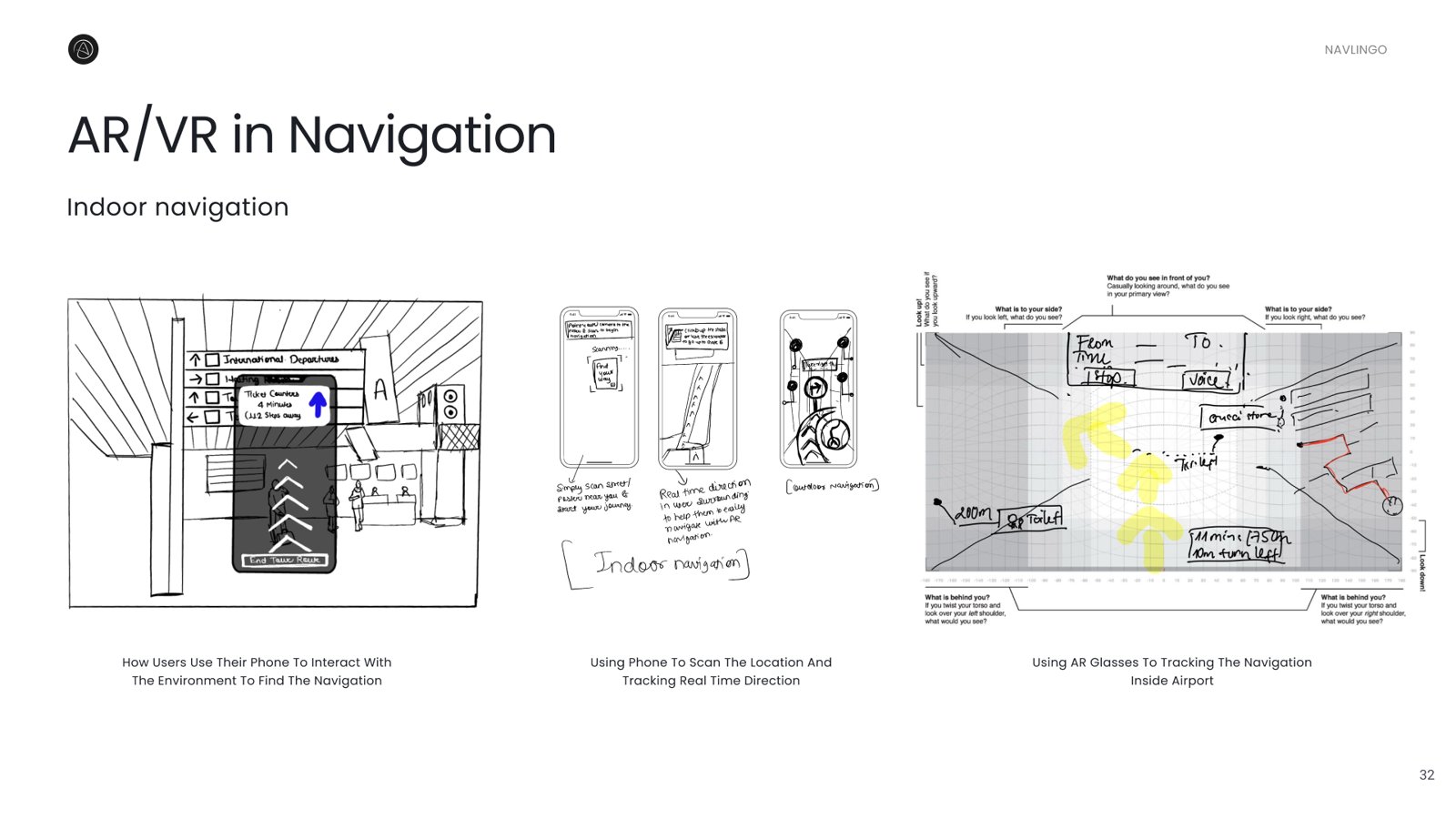
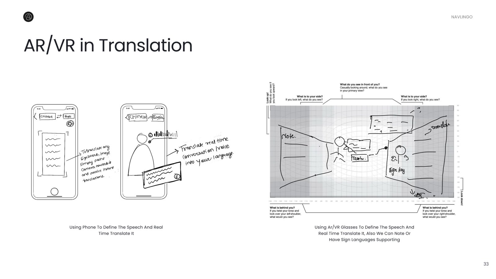
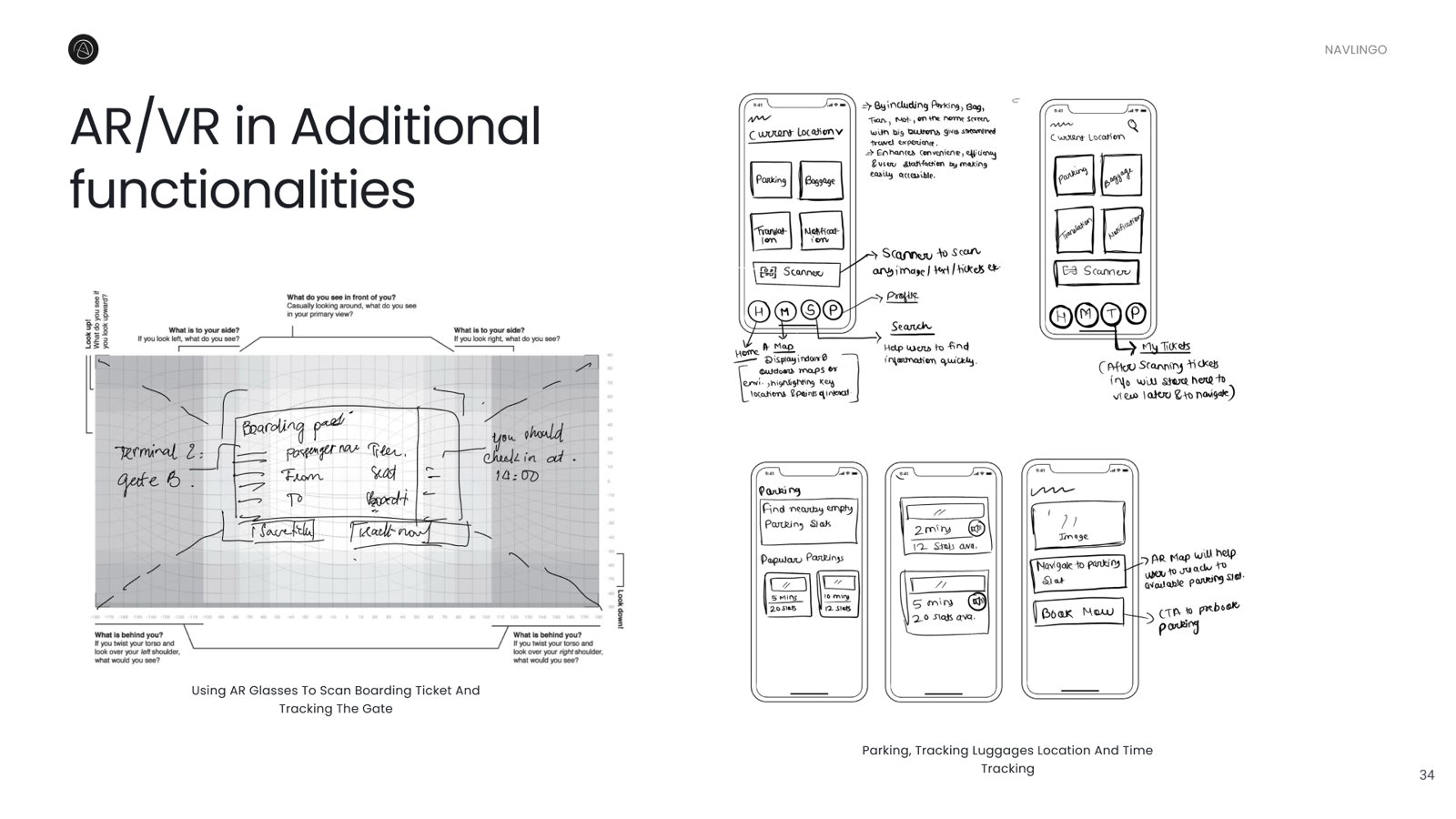
Navigation, translation and supporting features were sketched by hand before any pixels. Each sheet runs the same scenario twice, once on a phone and once through AR glasses.
That comparison settled the concept. On a phone every one of these tasks means looking down in a crowded terminal, while through the glasses the same information sits in the field of view. The third sheet is where baggage tracking, parking and ticket scanning first appeared, and all three made it into the build.
Four decisions shaped the whole interface, then five spatial screens put them to work.
Electric Purple
Brand & active path
Success Green
On-time · confirmed
Warning Amber
Closing soon · delay
Error Red
Gate change · overweight
Void Dark
Spatial UI backdrop
One accent, the rest reserved for status. A dark, low-vividness scheme minimises glare and keeps AR objects legible.
Every colour passes WCAG AA and was checked for colour-blindness.
Inter, for legibility and multi-weight hierarchy across 13-28px spatial sizes.
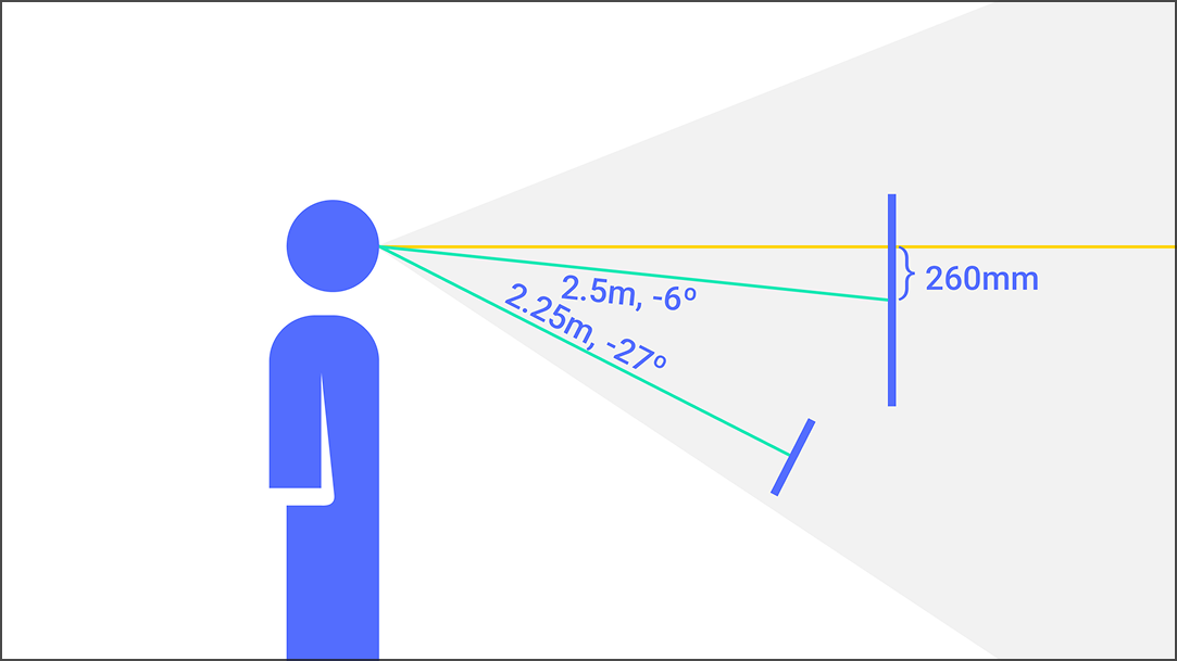
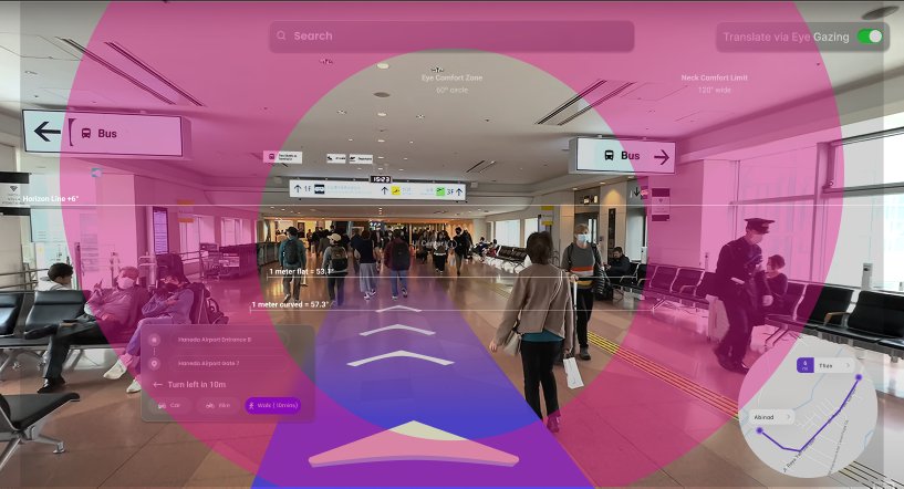
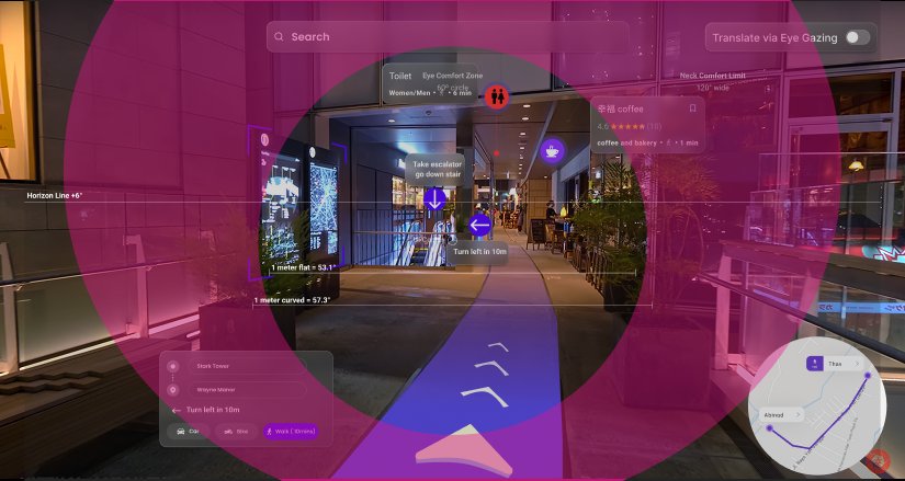
Horizon at +6°, gaze angles −6° and −27°, reading distance 2.25-2.5m. Mapped onto real corridors so key UI stays within a relaxed gaze range.
Six success criteria were designed against from the start, not retrofitted, from hands-free control through to a minimum spatial target size.
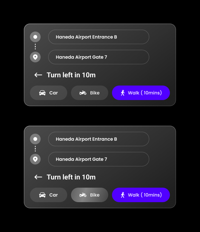
Hover dwell (300ms). Elements highlight once the gaze rests on them for 300ms, confirming intent before activation.
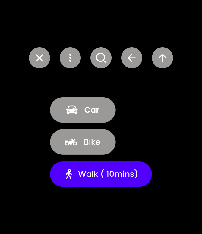
Rounded target shapes. Rounded hit shapes reduce eye-tracking jitter and prevent accidental activations (per Apple visionOS guidelines).
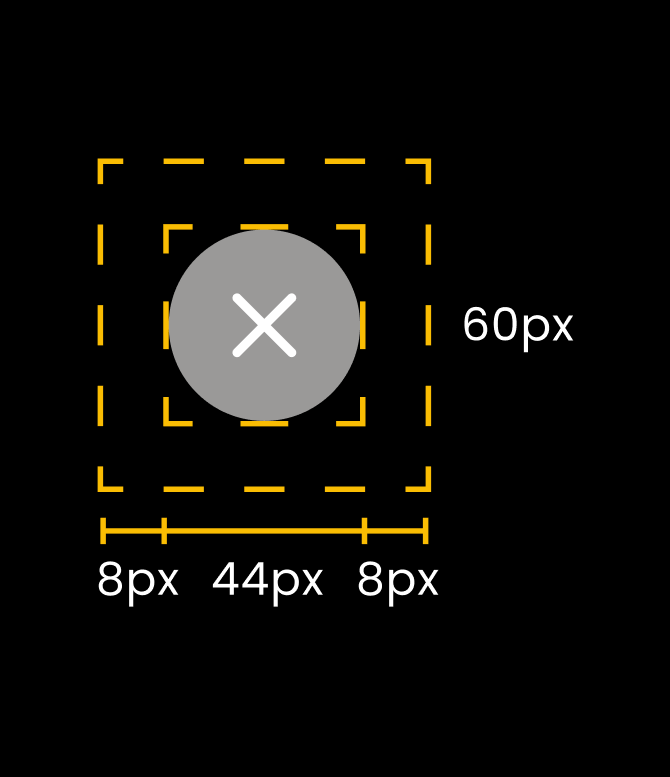
Spatial target sizing. A 44px visual target with a 60px invisible hit region (8 + 44 + 8) accommodates natural gaze wobble.
Dynamic scale. Targets grow as the user moves away and shrink up close, so everything stays comfortably tappable at any distance.
High-fidelity interfaces
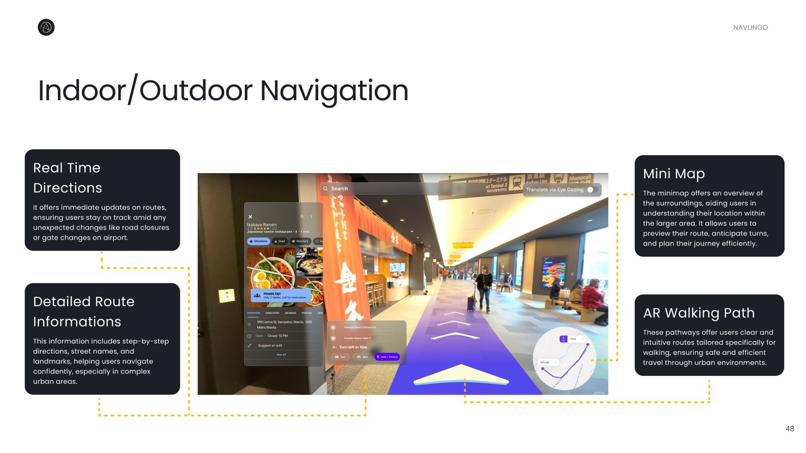
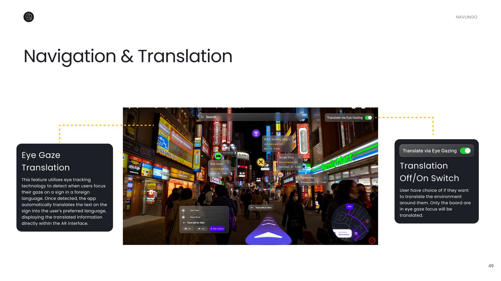
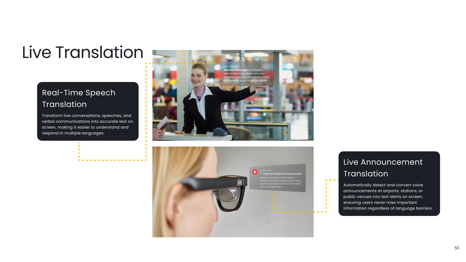
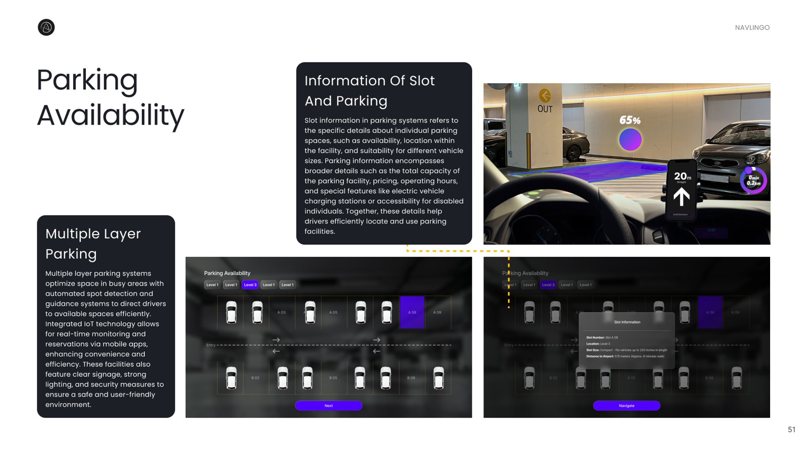
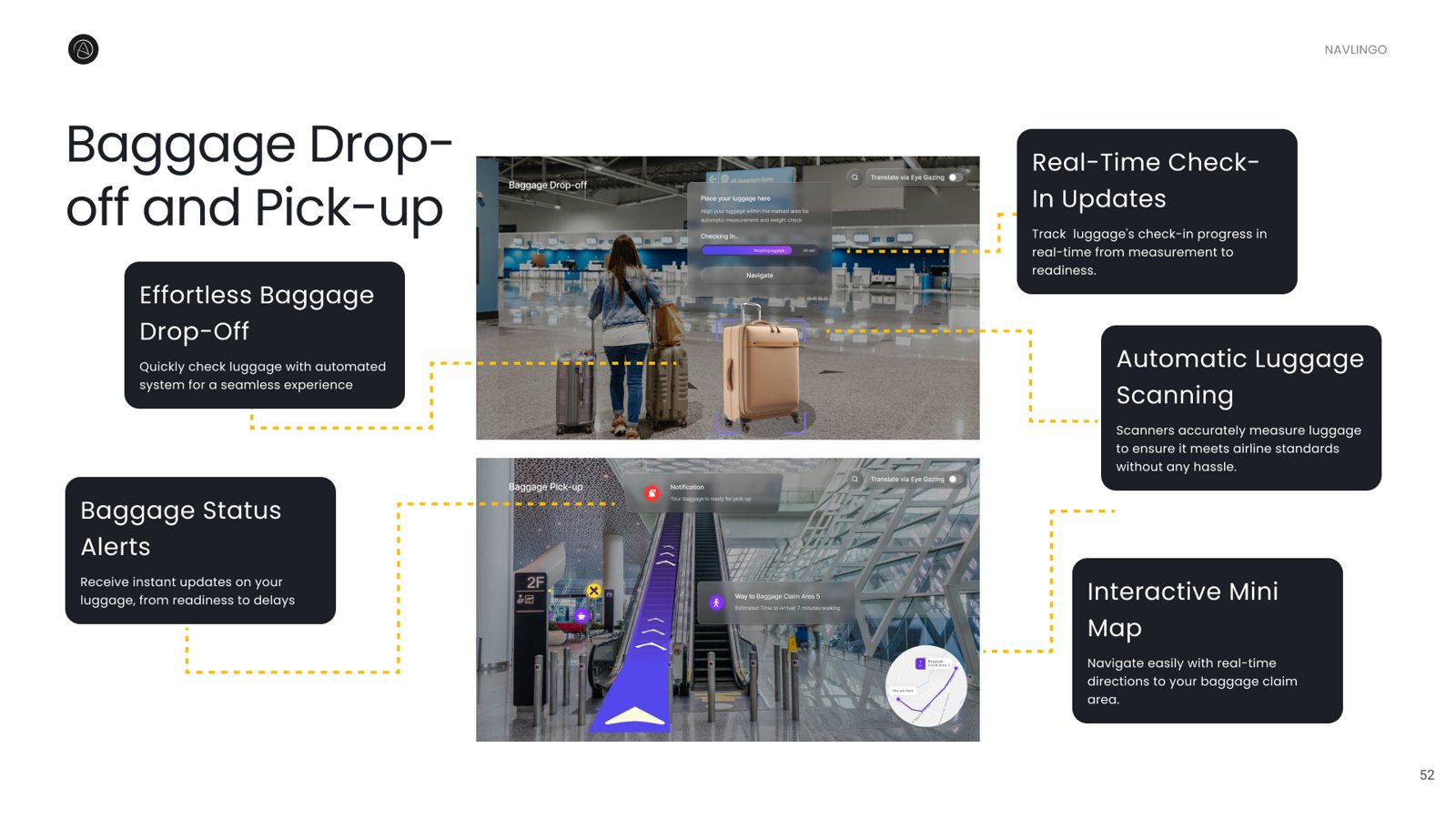
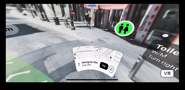
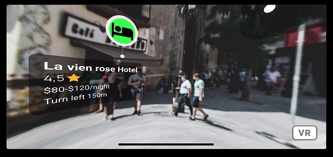
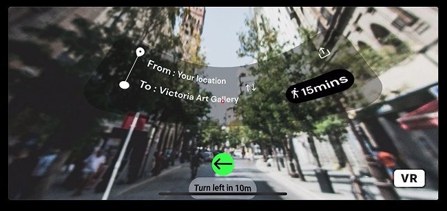
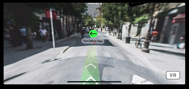
Five spatial interfaces, navigation & translation, live sign translation, baggage drop-off, smart parking and outdoor directions.
How we tested
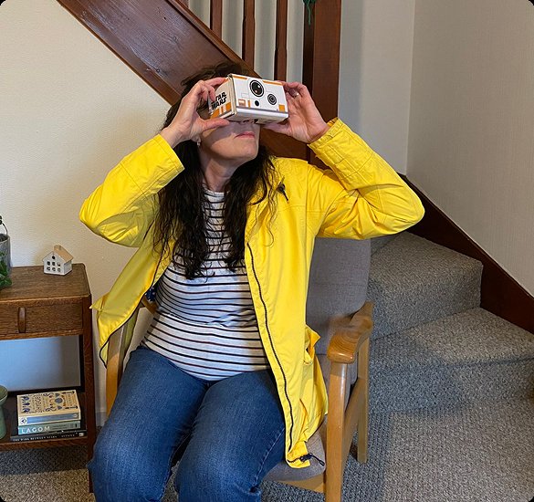
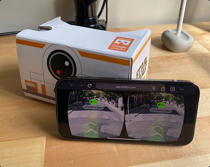
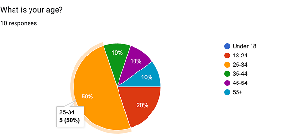
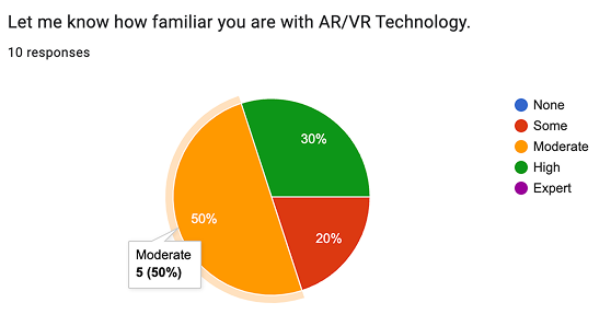
We prototyped in Figma with Draft XR and tested on Google Cardboard with 10 users (aged 18-45, 50% with prior AR familiarity), running heuristic evaluation, scenario testing and a post-test survey and interview.
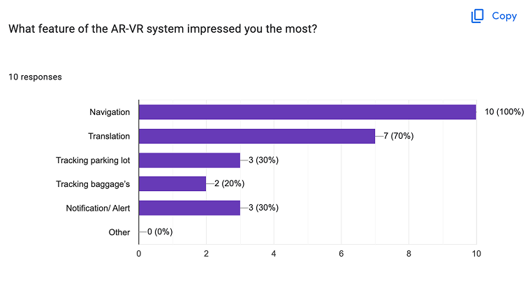
Which features impressed testers most
Post-test survey, features participants found most impressive (multiple selection).
Survey results
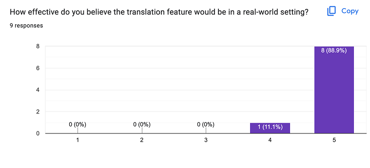
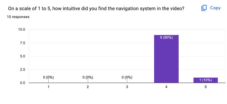
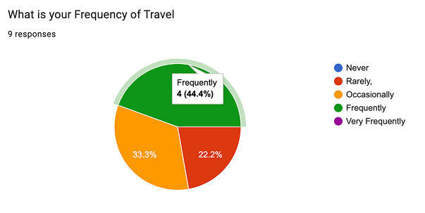
The full post-test survey, overall satisfaction, navigation, translation accuracy, feature preference and travel frequency.
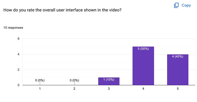
Key findings
Navigation satisfaction
90% of participants rated the AR navigation flow intuitive and effective, the strongest-performing feature.
Overlay contrast
In bright sunlight, translated text needed darker backing panels to stay legible.
Eye-gaze calibration
Two participants needed manual re-calibration; gaze alignment must be more forgiving out of the box.
Visual clutter
Dense signage caused overlapping text, solved by filtering translation targets by gaze dwell.
Dynamic font scale
Text under 14px was hard to read at distance; a 16px minimum spatial-text rule was established.
A concept taken as far as Google Cardboard and Draft XR would carry it.
What worked
Accessibility-first design improved spatial UI clarity for everyone, not just low-vision users
Hands-free eye-gaze control proved ideal for travellers carrying luggage
Google Cardboard + Draft XR enabled rapid validation without multi-thousand-pound hardware
What we’d change
Test with native speakers across 10+ languages
Deploy on HoloLens 2 / Apple Vision Pro for true optical pass-through testing
Add adaptive contrast backing driven by ambient-light sensors
Sources and standards